8 Cafe Menu Ideas Worth Trying in 2026
Practical cafe menu ideas for drinks, food, seasonal specials, and QR-ready presentation, with mobile-first tips for independent hospitality operators.
What do guests see after scanning a café's table sticker: a clear route to coffee and breakfast, or a crowded page that needs pinching, scrolling, and guesswork? A menu can look excellent above the counter and still be awkward on a phone.
Most phone-menu problems begin with structure. Drinks with different preparation methods sit together, breakfast availability appears below the dishes, and extras are separated from their prices. An attractive QR sticker can invite a scan, but it can't make confusing menu content easier to understand.
The strongest cafe menu ideas solve both problems: what to offer and how to present it after the scan. Each section below addresses a practical reading, navigation, or ordering decision, with attention to what staff can prepare.
Phone-first rule: Guests should be able to identify a suitable item, understand what comes with it, and find its price without reconstructing information from different parts of the page.
All example venues, dishes, and prices below are illustrative, not recommendations or descriptions of operating businesses. The focus is menu structure and presentation rather than pricing strategy. Currency symbols are omitted from the fictional examples; a real menu should make its currency clear.
1. Espresso and Coffee Board Section
A coffee board should help a regular find an Americano quickly without leaving a less experienced guest guessing what a cortado contains. Group drinks by preparation method, then explain the differences with short, useful descriptions.
The need for both familiar and specialty options is clear. In its coverage of National Coffee Association reporting, 4029 News reported that 46% of American adults consumed specialty coffee daily in 2025, compared with 42% consuming traditional coffee daily.
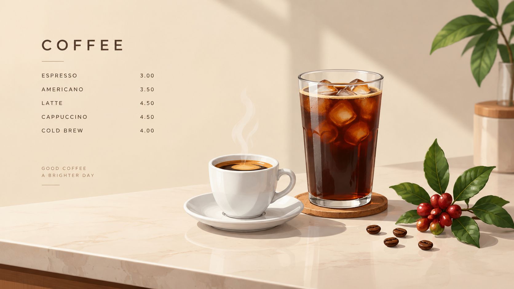
At fictional Maple Street Coffee, the espresso group could contain Flat White, Cortado, and Americano. Filter could hold a single-origin pour-over, while Cold contains cold brew and iced latte. Illustrative prices might read Flat White 3.50 and Cold Brew 4.00.
Keep the comparison on the screen
Descriptions such as milk-forward, short and concentrated, or bright and fruity give guests useful distinctions without lengthy tasting notes. Size, serving temperature, and included milk should sit beside the relevant drink, not in a distant footer.
- Check the route: Open the coffee category on a phone and count the taps needed to reach the café's most frequently ordered drink.
- Keep extras readable: Use the same font size for add-on prices and base prices.
- Frame, don't crowd: Coffee imagery can surround illustrated QR artwork, but decorative cups and beans shouldn't compete with the code.
A large photograph above every drink makes comparison harder by pushing names and prices apart. Reserve prominent imagery for a featured drink and keep the core board compact.
2. All-Day Breakfast Section
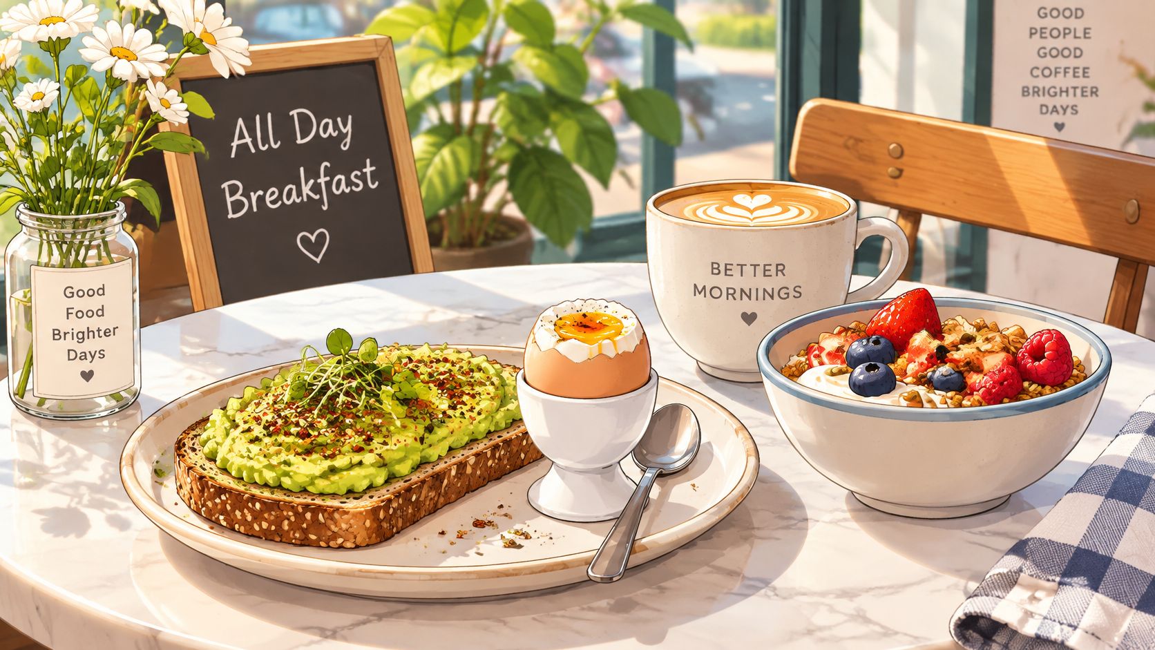
At fictional Harbor Bakehouse, a guest scanning for breakfast should immediately find Avocado Toast, Eggs Any Style, and Granola Bowl. Illustrative prices of Avocado Toast 8.50 and Granola Bowl 6.75 belong alongside those names, with an availability note above the list.
Served all day is clearer than a breakfast heading that leaves guests wondering whether service has finished. For a time-limited offering, a plain note such as Until 11:00 works as an illustrative format, provided the actual venue uses its real service hours.
Describe the plate before the extras
An avocado-toast description should identify the bread, spread, toppings, and anything served alongside it. A granola bowl should identify its yogurt or other base rather than leaving guests to infer ingredients from a photograph.
Keep the most requested additions visible, but don't turn every dish into a long modifier directory. If eggs, avocado, or a bread substitution are available, place those choices directly beneath the dish they change.
- Test line wrapping: Compare the section on a small phone and a larger phone, especially long dish names beside prices.
- Check kitchen capacity: An all-day promise only works if staff can prepare breakfast while handling lunch.
- Separate availability: Distinguish the venue's opening hours from the hours during which breakfast is served.
A hotel café may need separate breakfast and lunch availability even when both appear on the same page. Clear service notes prevent the menu from promising something the kitchen isn't offering.
3. Pastry and Bakery Case Section with Allergen Information
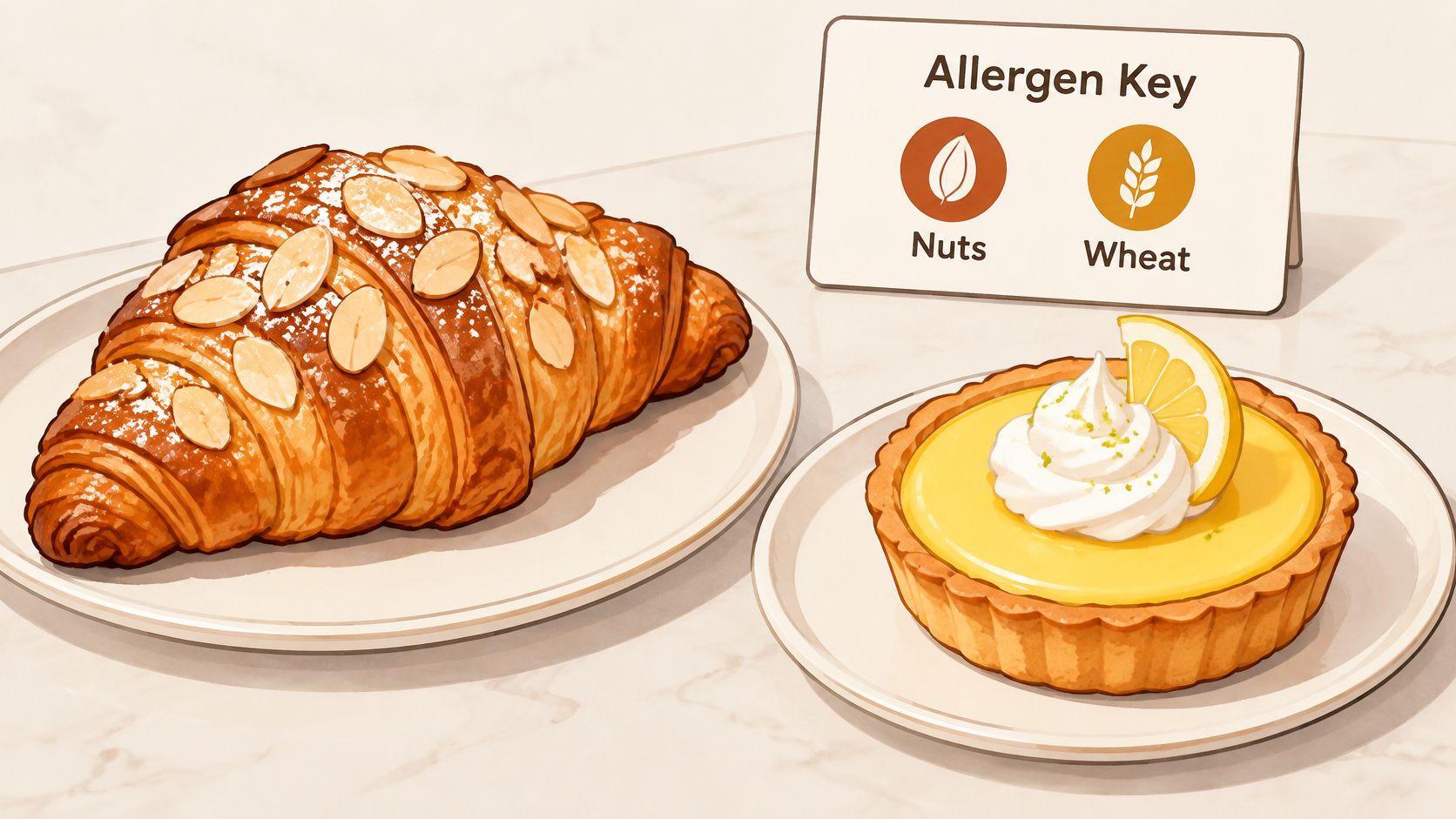
A pastry photograph isn't an ingredient declaration. Guests looking at an almond croissant need more than a recognisable topping, particularly when fillings, glazes, and supplier recipes aren't visible.
At fictional Sunrise Patisserie, Almond Croissant 3.80 and Lemon Tart 4.20 are illustrative menu entries. Almond and wheat markers could accompany the croissant, while egg and wheat markers could accompany the tart, but those markers are only starting examples, not complete allergen declarations.
Verify the recipe, then design the label
The National Restaurant Association's State of the Restaurant Industry report identifies clearer labeling, allergen-friendly choices, and ingredient transparency as menu priorities. On a phone, that means placing ingredient information with the item rather than hiding it behind an unexplained symbol.
Operators should check applicable requirements with local food safety authorities. EU Regulation No 1169/2011 and US packaged-food legislation, including the Food Allergen Labeling and Consumer Protection Act and the FASTER Act, shouldn't be treated as interchangeable rules for every café menu.
- Verify specifications: Check recipes, fillings, decorations, and supplier documentation before publishing allergen information.
- Explain symbols: Pair icons with readable labels so guests don't have to interpret a tiny drawing.
- Review changes: Recheck the entry whenever a recipe, supplier, or substitution changes.
Safety distinction: An ingredient list describes the recipe. Cross-contact information describes preparation conditions. Guests may need both.
A short invitation to ask the team about allergens can support the information, but it shouldn't replace accurate descriptions or a staff process for answering questions.
4. Tea and Non-Coffee Drinks Section
Non-coffee doesn't mean caffeine-free. Tea, chai, and hot chocolate need their own descriptions rather than being grouped under an inaccurate promise.
Fictional Willow Tea House could divide its section into Black Tea, Herbal, and Other Drinks. Earl Grey and English Breakfast belong under Black Tea, Chamomile and Peppermint under Herbal, and Hot Chocolate under Other Drinks, with illustrative prices of Pot of Tea 3.20 and Hot Chocolate 3.90.
Make serving format obvious
A pot, cup, and takeaway serving aren't interchangeable. Show the serving format beside the name, and present a pot as a distinct size row when it changes the portion or price.
For a café attached to a hotel, a pot of tea may suit seated guests while a takeaway cup suits departures. Both can appear clearly without repeating the entire tea description.
- Verify caffeine wording: Base descriptions on the actual ingredients and supplier information.
- Name the preparation: Explain whether chai is brewed from tea, made with a concentrate, or prepared another way.
- Clarify milk: State whether milk is included, optional, or part of the recipe.
- Compare artwork: Tea leaves, cups, or fruit can provide a more suitable sticker theme than espresso imagery for a tea-led venue.
The trade-off is breadth versus readability. A long tea catalogue can work if categories remain easy to browse, but a single undifferentiated list makes similar names difficult to compare.
Keep flavour descriptions short and concrete, such as floral, citrus-led, or minty. Avoid wellness promises that the venue can't substantiate, and keep practical details more prominent than decorative language.
5. Build-Your-Own Sandwich or Bowl Section
Build-your-own menus can clarify choices, but they can also bury the final dish beneath a stack of decisions. The best phone version follows the same sequence staff use to assemble the order.
For fictional Corner Grain Kitchen, that sequence might be Base, Protein, then Toppings. Brown Rice or Mixed Greens starts the bowl, Grilled Chicken or Tofu follows, and the illustrative offer includes three toppings, with extras at 0.75 each.
Show what's included before asking for choices
The opening line should explain the base offer before listing upgrades. Otherwise, guests can't tell whether selecting protein completes the dish or adds another charge.
A compact opening view with three to five choices per step is a practical design recommendation, not an industry benchmark. Longer lists can sit in clearly labeled groups, but guests shouldn't need to remember choices from another screen.
- Keep the sequence stable: Use the same order for every build-your-own dish.
- Attach charges: Put each surcharge beside the ingredient it applies to.
- Explain substitutions: Separate replacements from additions so the distinction isn't left to staff.
- Test comprehension: Ask someone unfamiliar with the menu to describe the finished bowl and what is included.
The operational trade-off matters as much as the screen layout. Every topping needs storage, portioning, replenishment, and an accurate ingredient record.
The W3C Mobile Accessibility Task Force guidance recommends touch targets of at least 9 mm by 9 mm, with inactive space around smaller controls. Where choices use expandable controls, cramped tap areas can make an otherwise clear sequence frustrating.
6. Seasonal and Limited-Time Specials Section
A seasonal special should be easy to discover and easy to remove. Mixing it into the permanent coffee board leaves staff with more places to check when the offer ends.
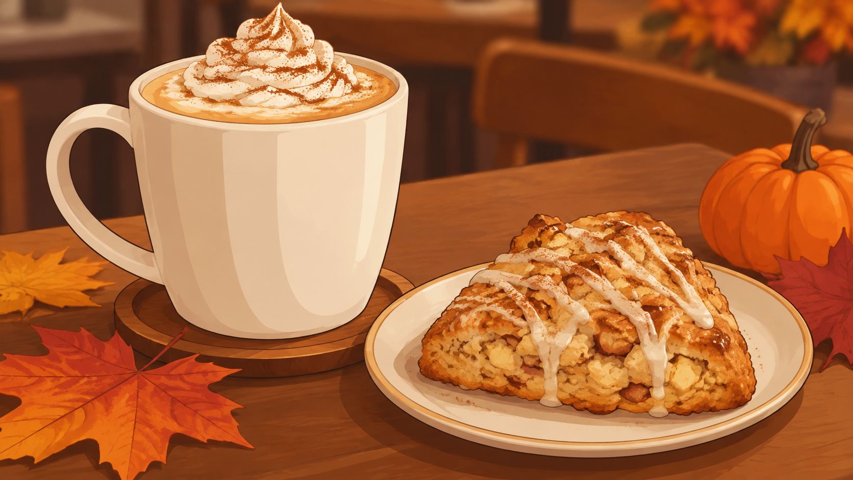
Fictional Harvest Lane Café could show Pumpkin Spice Latte and Apple Cinnamon Scone under Autumn Specials, with the illustrative availability note Available through November. An illustrative Pumpkin Spice Latte 4.50 entry should explain the flavour and serving format rather than relying on its seasonal name.
Keep the sticker useful beyond the promotion
A coffee-themed sticker can remain appropriate after an autumn special disappears. A sticker dominated by pumpkins may look outdated once the menu returns to its regular offering.
Match permanent print to the venue's identity, not to the shortest-lived item on the menu.
On a separately maintained menu page, content can change without replacing the sticker if the destination remains the same. That principle doesn't mean every QR-menu demonstration includes editing or publishing tools.
- Assign a review date: Give a staff member responsibility for checking the special's availability.
- Keep a separate category: Remove expired items without disturbing core drinks and food.
- Check every reference: Review descriptions, featured images, and availability notes together.
The QR menu presentation blog provides another place to explore menu-presentation ideas, but the useful test remains the actual phone screen.
Seasonal variety also needs an operational limit. A special built from existing ingredients may be easier to execute than a visually impressive drink requiring separate equipment, unfamiliar preparation, and ingredients used nowhere else.
7. Dietary Preferences and Vegan Options Section
A guest looking for a vegan lunch shouldn't have to open every dish description. Consistent markers can make suitable options visible while preserving the menu's normal food and drink categories.
Fictional Green Bean Corner could highlight Lentil Soup, Roasted Vegetable Wrap, and Oat Milk Latte in a plant-based section. Any prices shown would be illustrative, and every dietary label would still need checking against the complete recipe.
Explain the legend where browsing starts
A compact legend could define V as vegetarian, VG as vegan, and GF as gluten-free. The letters aren't useful unless guests can find their meaning, so check whether the legend appears on the first phone screen or remains easy to reopen.
A dedicated plant-based section can help discovery, but duplicating dishes creates a maintenance problem. If the same wrap appears in lunch and plant-based lists, both descriptions need to stay consistent.
- Check the complete dish: Review bread, sauces, garnishes, and optional extras, not just the main ingredient.
- Separate preference from allergy: A vegan marker doesn't establish suitability for a guest with a milk allergy.
- Qualify substitutions: A dish made vegan by removing cheese needs different wording from a dish served vegan as standard.
- Review handling: Gluten-free claims require attention to preparation conditions as well as ingredients.
Labeling principle: Dietary shorthand should help guests find a possible choice, not imply a safety guarantee the kitchen can't support.
An oat-milk latte also needs careful wording if flavoured syrups or toppings change its suitability. The phone menu should show what the standard version contains and explain which changes are available, rather than making guests assemble that information from unrelated notes.
8. Grab-and-Go and Takeaway Section
For a guest standing beside a food truck, a long seated-dining menu is the wrong starting point. Ready-to-take items should be visible near the top, especially when guests need to distinguish prepared stock from food made to order.
Fictional food truck and café Route 9 Eats could list Chicken Pesto Wrap, Fruit Cup, and Bottled Lemonade. Illustrative prices of Chicken Pesto Wrap 6.50 and Bottled Lemonade 2.80 demonstrate placement, not recommended selling prices.
Make the next action clear
A phone menu should explain whether guests choose from the display, ask at the counter, or wait for preparation. A useful description might identify a wrap as served chilled, provided that matches the actual service.
Keep this section compact and based on items the venue can reliably supply. If the list regularly shows unavailable food, guests must still inspect the counter or question staff before choosing.
- Prioritise speed: Place ready-made items before long descriptions of made-to-order dishes.
- Clarify packaging: Explain whether utensils, dressing, or other components are included when that affects the choice.
- Show the service route: State where guests collect or request the item.
- Avoid false controls: A browsing menu shouldn't display buttons that imply ordering or payment functions it doesn't provide.
Google's mobile guidance recommends minimising webpage loading time. For a takeaway menu, test whether names, prices, and categories appear promptly before large decorative images finish loading.
A sample menu demonstrates layout and navigation; it doesn't take orders or payments. That distinction should remain obvious, especially when the presentation resembles an interactive ordering screen.
Menu Section Ideas at a Glance
Scan the table below on a phone, the way a guest would after scanning a QR sticker at the table. The right column describes what works on that small screen, so use it to check whether a section reads clearly before it goes to print.
| Menu Idea | Best For | Key Design Challenge | Mobile Presentation Tip |
|---|---|---|---|
| Espresso and Coffee Board Section | Guests choosing coffee drinks | Keeping variations and add-ons from crowding the menu | Group drinks by preparation method and keep descriptors short |
| All-Day Breakfast Section | Cafés serving breakfast throughout the day | Keeping availability times and add-on choices clear | Show a plain availability note and limit add-on rows |
| Pastry and Bakery Case Section with Allergen Information | Bakeries and cafés with pastry displays | Maintaining accurate allergen details and explaining icons | Pair clear allergen icons with a visible legend |
| Tea and Non-Coffee Drinks Section | Non-coffee drinkers, families, and caffeine-avoiding guests | Keeping long drink lists and caffeine claims manageable | Use short subgroups and separate pot sizes |
| Build-Your-Own Sandwich or Bowl Section | Guests who want customizable meals | Explaining steps and pricing without confusion | Show a few choices per step and state what the base price includes |
| Seasonal and Limited-Time Specials Section | Cafés promoting rotating items | Removing unavailable specials and keeping dates current | Keep specials in a separate section with a clear availability note |
| Dietary Preferences and Vegan Options Section | Guests seeking vegan, vegetarian, or gluten-free options | Keeping dietary claims accurate and icons uncluttered | Place a short icon legend near the top of the menu |
| Grab-and-Go and Takeaway Section | Guests in a hurry or ordering takeaway | Keeping item availability current as stock changes | Use a short, clearly categorized list near the top |
A café rarely needs all eight sections. Pick the ones matching what the kitchen serves, then load that combination on a phone and scroll it the way a guest would: prices next to names, legends visible without zooming, and no section so long it buries the rest.
Test Your Menu Structure Before You Print a Single Sticker
The strongest framework combines clear categories with honest detail. Group coffee by preparation method, show breakfast availability above the dishes, verify pastry allergens, and give non-coffee drinkers a visible route through the menu.
Keep build-your-own steps short, separate seasonal specials from permanent items, explain dietary markers, and place takeaway choices where hurried guests can find them. Not every café needs every section, and a smaller menu is preferable to empty categories or choices the kitchen can't reliably deliver.
Check the browser experience first
Open the menu on a phone and try ordinary tasks: find an iced drink, identify a breakfast dish's ingredients, locate a vegan option, and check a takeaway price. Compare a smaller screen with a larger one, watching for awkward line breaks, tiny controls, and prices separated from names.
qrmenu.design offers free sample menus without sign-up, including the fictional café Daily Ritual, alongside venue-specific examples and downloadable QR designs. Each sample offers an illustrated AI-designed QR sticker and a conventional QR code as PNG files, both opening the same matching sample menu; venues, dishes, prices, and AI-generated food photographs are illustrative. The custom menu maker remains in development, so creating, editing, or publishing a venue's own menu and connecting an existing menu link aren't currently available.
Test the print, not just the download
Before printing a production run, confirm that the code opens the intended public menu. Scan a printed test on more than one phone in its intended location, including under the lighting guests will encounter.
- Preserve the border: The ISO/IEC 18004 standard preview specifies a quiet zone four modules wide on every side of the QR code.
- Match size to distance: Visu Network's QR testing guidance gives a practical rule of a code side length around one-tenth of the scanning distance.
- Check the material: Test the actual stock and finish for glare, curvature, cropping, and nearby decoration.
Illustrated and conventional codes should be compared against the same destination so the test concerns print design rather than different menus. A successful test means the printed code opens the correct page and the guest can understand it, not a promise of sales or other business results.
qrmenu.design provides free sample digital menus and downloadable illustrated and conventional QR designs for hospitality venues. Explore the café examples at qrmenu.design, compare the phone layouts, and print a sample to assess the scanning experience before choosing a direction for a venue's own menu.