8 Digital Menu Ideas for Cafés, Bars and Restaurants
Eight digital menu ideas covering layout, navigation, QR stickers and phone testing, with free sample menus for cafés, bars and restaurants.
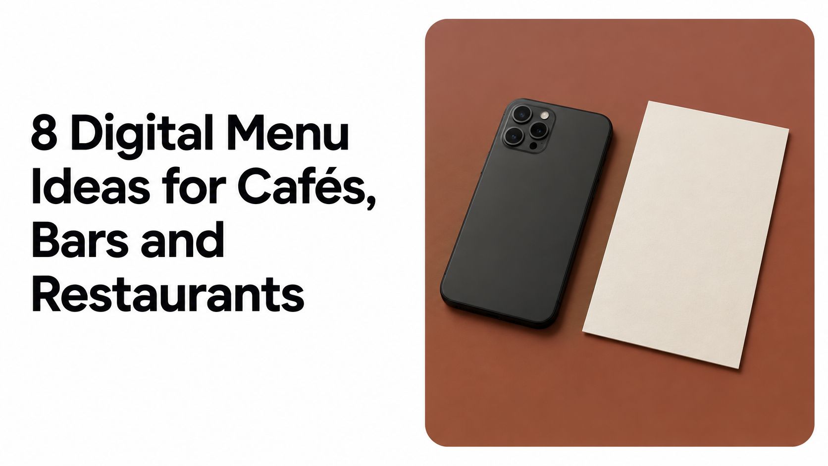
Can a menu that looks sharp on a designer's monitor still fail when a guest scans it at a dimly lit table? Yes, and it happens more often than the mockups suggest. Most menu decisions get made at a desk, on a large screen, with fast wifi and nothing in the way. Guests meet the same menu differently: phone in one hand, arm's length away, low light, sometimes a weak signal and a drink already on the table.
Digital menus are no longer an experiment. A Wakefield Research survey of 500 restaurant operators for Square's 2021 Future of Restaurants report found that 88% would consider replacing physical menus with digital menus, and the National Restaurant Association's 2021 industry report found 54% of casual-dining restaurants had already moved menus online, as Restaurant Dive reported. The format is settled. The execution is where venues lose people.
Good digital menu ideas answer four questions. How is the menu laid out? How does a guest move through it? How does the code look and scan? And can everyone at the table read it, including the guest holding the phone at arm's length and the one who has no smartphone at all? Each idea below comes with a test you can run on your own phone or printer before anything goes to a print shop, using free sample menus and QR downloads as the reference rather than a mood board.
1. Illustrated QR Sticker and Conventional Code Comparison
An illustrated QR sticker wraps a working code in artwork that matches the venue: a pizza slice for a pizzeria, a cup and saucer for a café, a coupe glass for a cocktail bar. The illustration sells the room. The code does the job, because a phone camera reads the modules and ignores the art.
Print both versions of the same menu before deciding which one earns a place on the table.
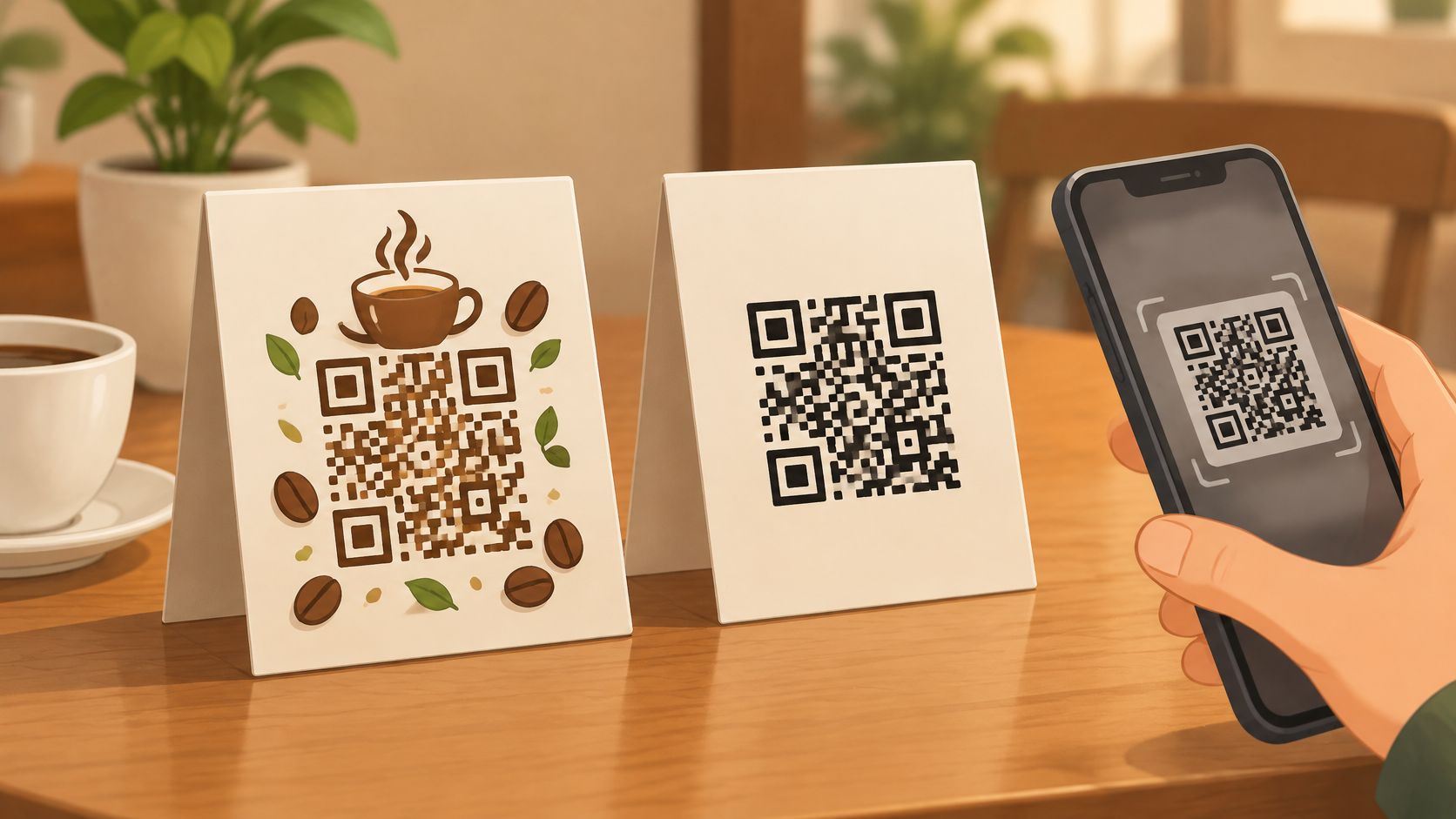
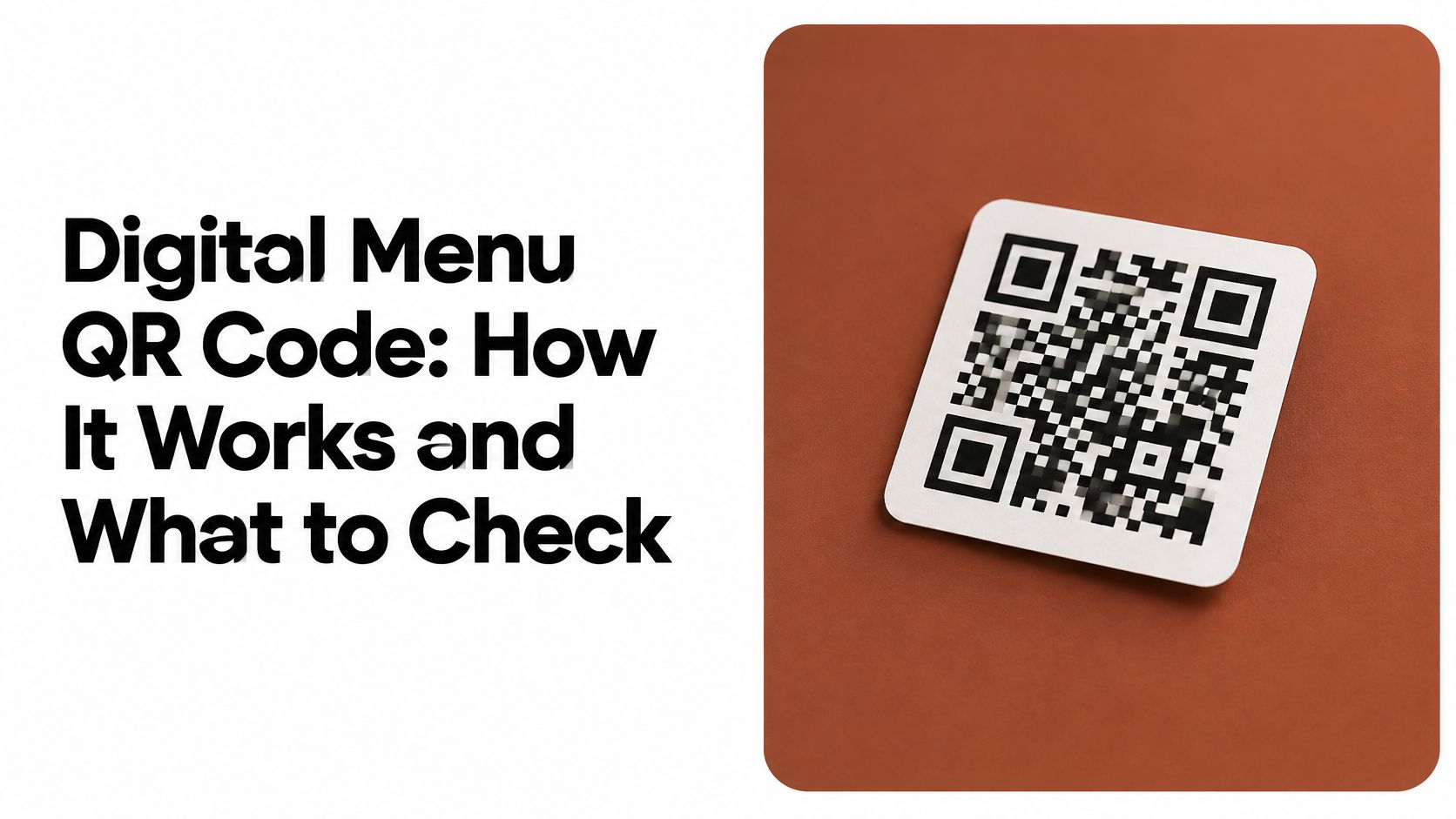
The plain black-and-white square is the control. It has no personality and it's instantly recognised as a code, which counts for more than it sounds. QR codes were developed by DENSO in Japan in 1994 for tracking parts in manufacturing, and the format was standardised internationally when ISO/IEC 18004 was issued in 2000, according to DENSO WAVE's history of the QR code. Guests have had decades to learn the shape.
The trade-off runs one way. Illustration earns a second look on a cluttered table and signals the venue's category before a word is read. It also crowds the symbol. Artwork, borders, a logo or a trim line that creeps toward the modules can slow a scan or stop it.
Practical rule: compare the illustrated sticker and the plain code on the same phone, in the same light, from the same seat. If one takes noticeably longer to open, the artwork is the problem, not the guest.
Run the comparison test
- Print at final size: keep a table code at least 2 cm square for close-range scanning and test it from the distance a seated guest holds a phone.
- Protect the quiet zone: keep illustration, text and trim lines clear of the modules and the empty margin around them.
- Label the plain version: one line such as "Scan for menu" removes the pause a bare square creates.
- Scan each twice: once at arm's length and once close up, on two different phones.
For a ready-made pair, qrmenu.design publishes sample menus with PNG downloads of an illustrated sticker and a conventional code that open the same sample menu, which makes a digital menu QR code comparison possible before any artwork is commissioned.
2. Browser-Based Menus Without App Installation
Every step between the scan and the dish costs guests. An app install, an account, a permission prompt, a "continue in browser" screen: each one gives a hungry person a reason to put the phone down and ask for paper instead.
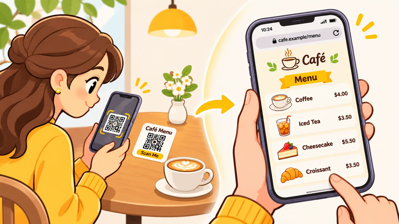
A browser-based menu removes all of it. The camera opens a link, the menu renders in the phone's browser, and the guest reads. Mixed groups are covered, since an iPhone and a mid-range Android land on the same page.
Acceptance data backs the narrow version of this idea. The National Restaurant Association's 2024 technology research found that 59% of full-service diners would use a QR code to open a menu on a smartphone, but only 48% were comfortable using QR technology to place an order and 46% to pay, according to the 2024 technology landscape report. In limited-service restaurants the same research found 57% for menu access, 52% for ordering and 48% for payment. Guests accept the code as an information layer. Fewer accept it as a till.
Test it on a real connection
- Use cellular data: load the menu on a mid-range Android and an iPhone with wifi switched off, standing in the dining room.
- Check the destination: open the exact URL printed on the code before the print run, and again after any menu change.
- Watch page weight: large uncompressed photographs turn a three-second load into a fifteen-second one on a weak signal.
- Try the awkward spot: a food truck window display on a busy street with poor signal is a fairer test than an office desk.
For a hotel, the same logic applies to an in-room card that opens a menu with no login and no download, a pattern set out in this guide to menus in hotels.
3. Category-Based Mobile Menu Navigation
A phone shows one screen at a time. A printed menu lets a guest take in four columns at once; a phone makes them scroll. Category navigation is what stops that scroll becoming a hunt.
The shape is simple: a short row of section labels at the top, each jumping to its group. A café might use breakfast, sandwiches, hot drinks and pastries. A pizzeria might use pizzas, pasta, salads and desserts. Five to eight labels fit one screen without shrinking to unreadable.
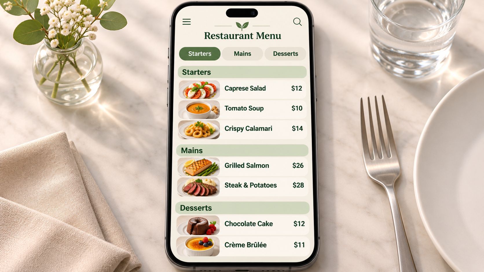
Tap size decides whether the structure works in a hand. WCAG 2.1 target size guidance recommends at least 44 by 44 CSS pixels for pointer-operated controls, and WCAG 2.2 sets a floor of 24 by 24 CSS pixels with spacing exceptions. Category tabs, back buttons and expandable sections need generous tap areas, not text links packed edge to edge.
Text size draws complaints too. In recent diner research, 26% of respondents considered small phone text a leading QR-menu complaint, as noted in an accessibility review of restaurant QR menus. That points at category labels and item names as much as at descriptions.
Say a café has eleven categories because the kitchen sells everything from smoothies to toasties. A guest looking for a sandwich scrolls past seven unrelated groups first. Merging to six and ordering each group by sales fixes more than any font change.
- Cap the categories: five to eight for a single-screen overview, using short nouns.
- Order by sales: put the most ordered items near the top of each group, working from your own sales records.
- Use real headings: semantic heading tags let screen readers jump between groups instead of reading the page from the start.
- Run the staff test: ask two or three staff to find one specific dish on their own phones and note where they hesitate.
4. Price and Description Presentation for Small Screens
On a phone, a three-line description per dish turns a menu into homework. Guests scan for a name and a price first, then read detail only if the name interests them.
Legibility decides whether the menu gets read at all. Small type, tight line spacing and low contrast force guests to zoom, and most will not bother. Keep body text large enough to read at arm's length on a mid-size phone, and test it on the oldest device in your own drawer. If the description blurs at that distance, shorten it or raise the size.
Align prices so the eye can find them
A consistent format beats a clever one. Each item gets a name, one or two short lines of description, and a price in the same position on every row. A cocktail bar listing a drink name, a two-line tasting note and a right-aligned price gives the eye a clean vertical line to follow. Move the price to the left on half the rows and the menu becomes a search task.
- Keep descriptions to two short lines: lead with what the dish is, then one detail that helps a decision.
- Fix the price position: right-aligned on every item, same weight, never wrapping to a second line.
- Keep allergen notes visible: below the description in smaller but still legible type, never behind a tap guests won't make.
- Check your labelling rules: allergen and dietary labelling requirements differ by country and by local authority, so confirm which rules apply to your venue before the menu goes live.
Sample layouts that already follow this pattern are collected in these café menu ideas, where fictional venues with example dishes and prices show the arrangement. Open one on a five-inch viewport and read a dish description without zooming. If you can't, neither can a guest holding a menu in one hand.
5. Table Sticker Placement and Guest Scanning Flow
Placement fails before design does. A code flat on a table under a drinks list, or on a wall behind the booth, gets missed no matter how good the artwork is.
Guests arrive with expectations set by the room. Lightspeed's UK hospitality research found that 85% of respondents preferred physical menus in casual-dining settings, while 93% expected them in fine-dining establishments, according to Lightspeed's 2024 UK hospitality data. A sticker that appears to replace the printed menu in a formal room reads as a cut, not a convenience.
The test is reach. Sit where a guest sits, put your hands where theirs are, and measure how far the code is.
Walk the flow as a guest
Say a bar puts a tent card at the bar edge with a single line, "Scan for drinks", and keeps the printed cocktail list in the holder beside it. The guest seated at the corner sees the card without turning, scans it, and reads the list. Nothing has been taken away.
- Choose a tent card or stand: a card angled toward the seated guest beats a flat sticker under glass.
- Place within reach: near the bar edge, beside the cutlery, or at counter height for a food truck window decal.
- Use matte stock: gloss reflects ceiling lights and kills contrast at the wrong angle.
- Replace worn stickers: a scuffed or bubbled sticker loses edge definition long before staff find it unacceptable.
Walk the full path once from a seated position: spot the code, read the instruction, open the camera, land on the menu, find a drink. Any pause in that sequence is a placement problem you can still fix cheaply.
6. Scan Testing and Print Checks Before Ordering
The most expensive mistake in this list is a reprint. The cheapest is a test sheet.
A printed code needs an empty margin around it, and that margin is part of the specification rather than decoration. DENSO WAVE specifies a clear margin four modules wide on all four sides, and the margin must contain no printing, as DENSO WAVE's QR code design guidance explains. A downloaded file may stop at the symbol edge, so the margin often has to be added in the print layout.
"Scan from where the guest sits, not from where you stand."
The four-sticker test
A café can print a sheet of four stickers at final size, scan them on two phones at the counter and at a window table, and only then order 200. The same routine catches a code pointing at last season's menu, which is the failure nobody notices until a guest mentions it.
- Test in venue light: scan under the dimmer evening lighting, not the office ceiling light.
- Vary the angle: close up, at arm's length, and slightly off-axis.
- Trim, then scan again: cut the sheet to the final sticker shape and re-scan, because trimming is where margins disappear.
- Check the destination last: confirm the URL opens the current menu, not a draft or an old version.
A pizzeria testing a table tent in a dim dining room learns more in ten minutes than a week of design review. If the code needs a second attempt, the fix is usually size, contrast or a crowded margin, in that order.
7. Venue-Type Sample Menus for Evaluation
Reading a sample built for the same kind of room is faster than imagining one.
qrmenu.design publishes sample menus for 36 venue types, from pizzerias to cocktail bars, and selecting a venue type changes both the QR artwork and the menu that opens. The samples use fictional venues, illustrative prices and AI-generated food photographs, so they demonstrate presentation and navigation rather than dishes from a working restaurant.
What a bar sample shows that a hotel sample doesn't
A cocktail bar leans on short categories and tasting notes, because a guest orders two or three drinks and wants texture words fast. A hotel restaurant splits breakfast, lunch and in-room dining, which forces a decision about how many categories a phone screen can carry before the list needs a second level. Comparing the two shows where structure follows service style rather than taste.
- Open on your own phone: judge category count, description length and price alignment at actual size.
- Compare two venue types: note where the structure changes and why it changes.
- Borrow the layout, not the content: sample items and prices are examples, not a template for your kitchen.
- Write down three changes: the gaps you notice in the first five minutes are the ones your guests will notice too.
A bakery owner comparing a café sample with a food truck sample usually finds the same thing: the truck needs fewer, flatter categories because the guest is standing outdoors. That's a useful constraint to discover before design work starts.
8. Hybrid Approach with a Printed Backup
Keep paper. That's the least fashionable recommendation here and the easiest to defend.
US Foods' 2024 Diner Dispatch survey found that 90% of U.S. diners surveyed preferred printed menus over QR-code menus, up from 74% in 2023, according to US Foods' survey announcement. Preference isn't refusal. Plenty of those guests will still scan when they want to check an allergen without handling a laminated card, or when the printed menu is missing a special.
A guest comparing the phone menu with the paper one is the normal case, not the exception.
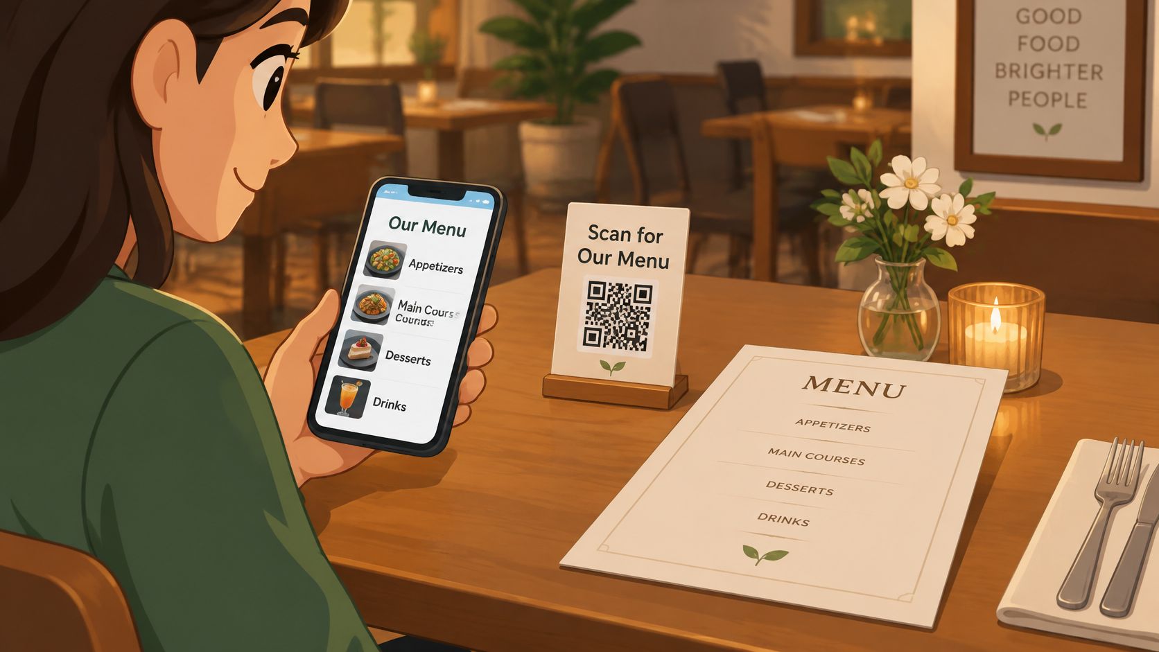
Operational rule: when the printed and digital versions disagree, a guest will find the difference at the worst possible moment. Update both from the same list on the same day.
A bakery can run printed breakfast menus on the counter and QR tent cards at the tables, then watch which guest reaches for which. A hotel restaurant can keep printed menus in the lobby and codes in the guest rooms, where a phone is the only thing within reach.
- Name the master document: one list is the source of truth, and both versions update from it.
- Brief the staff: printed menus get offered without comment on the guest's choice.
- Start with one section: test the QR menu on bar snacks before rolling it across the full list.
- Ask directly: a short question at the till about whether the menu was easy to find beats a survey nobody completes.
How the eight digital menu ideas compare
| Item | Primary Focus | Typical Venue Fit | Main Limitation | Printing Needed |
|---|---|---|---|---|
| Illustrated QR Sticker and Conventional Code Comparison | Comparing illustrated and plain QR code designs | Cafés, pizzerias, bars, and hotel restaurants | Artwork can affect scan reliability if poorly designed | Yes, for stickers or table cards; test before ordering |
| Browser-Based Menus Without App Installation | Opening a menu in a phone browser without an app | Bakeries, food trucks, and other mobile-friendly venues | Depends on internet connection and page performance | No menu print; print a QR code if using scan-based access |
| Category-Based Mobile Menu Navigation | Organizing a mobile menu into clear sections | Cafés, pizzerias, and restaurants with varied menus | Poor categories or long sections can make items hard to find | No menu print; a QR code may be printed for access |
| Price and Description Presentation for Small Screens | Making menu items, descriptions, and prices easy to read on phones | Restaurants, cocktail bars, and hotel dining | Long descriptions and small text reduce readability | No menu print; printed references need updating if prices change |
| Table Sticker Placement and Guest Scanning Flow | Making QR menus visible and easy to scan at tables | Restaurants, bars, and food trucks | Stickers can wear, glare, or be overlooked | Yes, for stickers, tent cards, or decals |
| Scan Testing and Print Checks Before Ordering | Verifying code scans and destinations before a full print run | Any venue using printed QR codes | Testing takes time and results vary by phone and lighting | Yes, print a test at the intended size |
| Venue-Type Sample Menus for Evaluation | Comparing sample menus by hospitality venue type | Cafés, pizzerias, bars, hotels, bakeries, and food trucks | Samples use fictional items and may not fit every concept | Not required to browse; optional for testing printed QR artwork |
| Hybrid Approach with a Printed Backup | Offering both a digital menu and a paper alternative | Venues serving guests with varied access preferences | Requires maintaining two menu versions | Yes, for printed menus and QR access cards |
Test One Idea This Week, Then Decide What to Print
Start with the idea that answers your biggest uncertainty. If the worry is layout, work through category navigation and the sample comparison, then check whether a guest can find a dish in one scroll. If the worry is scanning, print both code versions and run the four-sticker test in your own dining room light. If the worry is readability, open a sample on the smallest phone in the building and read a dish description without zooming.
The sequence matters more than the tools. Open a sample menu for your venue type on your own phone, walk the scan from a seated position, and print a test sheet before ordering anything. That order catches the expensive problems first: a code pointing at the wrong page, a category list too long for one screen, a price column that jumps around.
A few practical notes on what's available today. The sample menus and QR downloads on qrmenu.design are free and need no sign-up, and they use fictional venues with illustrative prices and AI-generated food photographs. Each sample offers PNG downloads of an illustrated sticker and a conventional code, both opening the same matching menu, so the comparison in idea one is a ten-minute job rather than a design project. Creating and publishing your own menu isn't possible yet. The custom menu maker is still in development and is planned to be free, so for now the samples are the best way to compare formats before committing to print.
What to do with what you learn: write down the three changes you'd make, decide which menu is the master copy, and keep the test sheet on the bar as a reminder of how the code performed at arm's length. Run the whole test again if you change the sticker size, the printing stock or the menu structure. A code that worked last quarter on a different layout isn't the same code.
When you're ready, explore the menu examples at qrmenu.design and pick the venue type closest to your own room.
qrmenu.design offers free sample menus for 36 venue types, each paired with a downloadable illustrated QR sticker and a conventional code that open the same browser-based menu. If the ideas above raised a question about layout, scan reliability or readable prices, those samples give you something real to scan from your own table before you commit to print. Visit qrmenu.design to explore the menu examples and download a code.