Menu in Hotels: Formats, Design and Guest Access
Compare restaurant, room-service and browser-based menu in hotels: formats, guest access, accessibility and printing tips for hotel operators.
A guest arrives late, opens the room-service card and finds no clear indication of what's still available. Downstairs, another guest scans a table code but struggles to read the drinks list. The kitchen may be ready to serve both, yet the menus leave staff answering questions that clearer presentation could have resolved.
A useful menu in hotels connects the guest's immediate need with the kitchen's actual offer. That means choosing the right format, showing prices and availability clearly, making profitable dishes easy to find, and keeping access practical on paper and on a phone.
Hotel Menu Formats Compared at a Glance
At a restaurant table, guests need enough information to choose a meal and speak to a server. In a guest room, they also need service hours, delivery details and an obvious way to contact staff. Those are different reading situations, even when the kitchen prepares the same dishes.
A QR menu is a delivery method, not a separate food-service format. A restaurant menu, room-service list or bar menu can all appear in a browser after a scan.
Hotel menu formats, guest moments and design needs
| Format | Where guests use it | How they order | Core design need |
|---|---|---|---|
| Restaurant menu | Dining room tables | Choose from the table menu and order through a server | Clear categories and dietary notes |
| Room-service menu | Guest room | Choose from a card and phone or call staff | Short list with clear hours and delivery notes |
| Banquet and catering menu | Event rooms | Event planner selects a set menu | Fixed packages rather than a long à la carte list |
| Minibar list | In-room fridge | Self-serve from a priced card | Item sizes and prices shown on the card |
| Bar and lounge menu | Bar, lounge or pool area | Order at counter or from server | Drinks grouped by type |
| Browser-based QR menu | Guest's own phone | Scan sticker, then read menu in browser | Fast loading and tappable categories |
Match the format to the decision
A banquet planner needs to compare packages, inclusions and serving arrangements before an event. A minibar guest needs to identify a particular bottle or snack and its price without guessing which description belongs to it.
The bar list has another task. Guests may begin with a drink type rather than a particular product, so headings for wine, beer, cocktails and alcohol-free drinks give them a useful starting point. Practical examples of drink menus for bars can help operators think through that category structure.
Browser access removes an extra step from the sample-menu experience: guests point their phone camera at the code, follow the prompt and open the menu without installing an app or creating an account. Reading a menu isn't the same as placing an order, so the page should still explain whether guests speak to a server, visit the counter or call staff.
Planning rule: Start with the guest's location and decision, not with the appearance of the QR sticker.
The table works as a design checklist. Operators can select the row matching the guest moment, then carry its core requirement into the printed layout, browser page and staff procedure.
Why Hotel Menus Carry Real Revenue
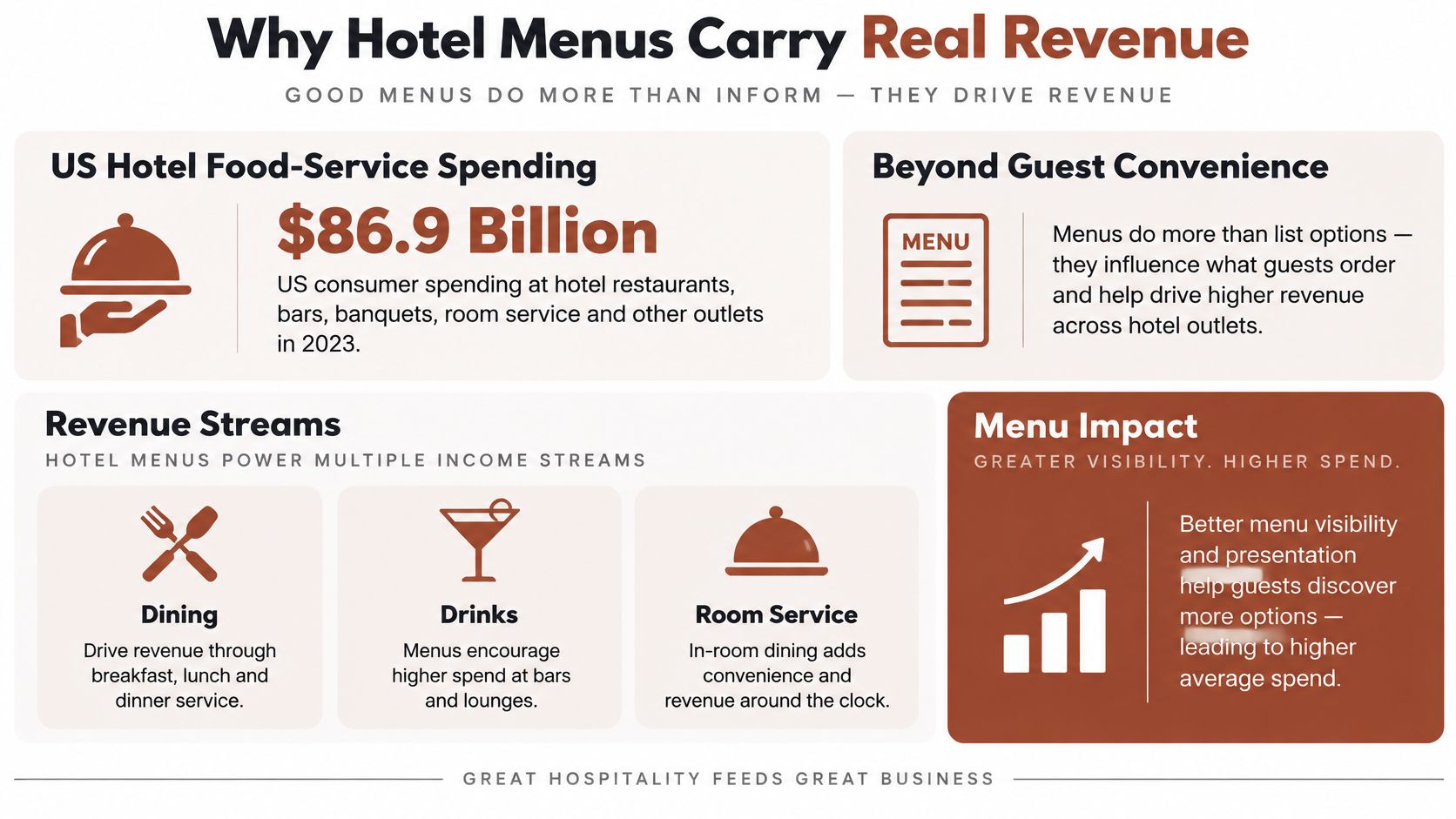
U.S. consumer spending across hotel food-service operations reached $48.7 billion in 2017, with 4.9% growth that year and an average annual growth rate of 5.5% since 2011, according to the industry analysis published by Foodservice Equipment & Supplies. That historical analysis attributed approximately 25% of lodging food-and-beverage revenue to full-service restaurants, 41% to banquet and catering operations, and 19% to adult beverages, with higher beverage proportions in luxury and upscale properties.
These shares describe different dimensions of revenue. Adult beverages can be sold through restaurants, bars and events, so the beverage share shouldn't be added to the outlet shares as though every category were separate.
Separate historical mix from current performance
A CBRE analysis drawing on a paired operating-survey sample of 2,669 U.S. full-service, resort and convention hotels reported that food-and-beverage revenue per occupied room rose 3.8% in the first six months of 2025, compared with 3.0% growth in total hotel revenue. The same analysis reported venue food revenue growth of 5.2% and banquet food growth of 4.0%, while venue beverage revenue was flat and banquet beverage revenue declined 2.0%.
The older figures establish scale and historical revenue mix. The newer figures show why managers shouldn't assume that food, drinks and event packages move together.
Neither set describes every independent hotel. Both are U.S.-focused, although the combination of restaurants, bars, events and room service is relevant to full-service properties elsewhere.
Choose the next edit commercially
Before commissioning new layouts, managers should examine revenue by outlet and service period:
- Dining-room food: Check whether guests can identify suitable dishes and see what's included.
- Banquet packages: Make package differences, inclusions and upgrade choices easy to compare.
- Bar service: Review category balance, descriptions and actual availability rather than copying the restaurant structure.
- Room service: Compare the offer with the kitchen's delivery capacity and operating hours.
A property with substantial event income may need clearer banquet packages before a redesigned breakfast card. Another may need to resolve an unclear lounge list first.
Treat each menu as a revenue tool. The starting point is the property's own income mix, not an assumption that the most visible menu deserves the most attention.
Which Menu Items to Feature, Reprice or Remove
Menu-mix percentage means an item's unit sales divided by total unit sales within its category. Contribution margin means selling price minus food cost, not the final profit left after all operating expenses.
The eCornell menu-engineering guide uses a popularity threshold of 70% of the category's average selection rate and compares contribution margin with the category's weighted average. These benchmarks produce the following decision groups.
Menu engineering groups and actions
| Group | Rule | Action |
|---|---|---|
| High popularity, high margin | Selection rate at or above the popularity threshold; margin at or above category weighted average | Feature prominently |
| High popularity, low margin | Selection rate at or above the popularity threshold; margin below category weighted average | Re-cost or reprice |
| Low popularity, high margin | Selection rate below the popularity threshold; margin at or above category weighted average | Promote through placement and description |
| Low popularity, low margin | Selection rate below the popularity threshold; margin below category weighted average | Redesign, replace or remove |
Compare starters with starters, main courses with main courses, and desserts with desserts. Combining them creates an unhelpful baseline because guests don't necessarily select each course equally often.
Margin doesn't establish demand
In a study of a large hotel restaurant in Kuta, Bali, only 3 of 18 main-course items, or 16.7%, were highly popular, while 14 items, or 77.8%, had high contribution margins. The distinction matters: an attractive margin on a recipe doesn't mean guests will order it.
Consider a fictional hotel with a slow-selling vegetable main. Before removing it, management should check whether its description explains the dish, whether staff can describe it confidently, and whether it appears in a category guests browse.
A popular but low-margin dish calls for a different response. The chef might review ingredient purchasing, portion consistency or accompaniments before management considers a price change.
Build a usable review file
The analysis needs dependable inputs:
- POS sales history: Export item quantities for a defined, representative service period.
- Standardized recipe costs: Include garnishes, sauces and accompaniments rather than the main ingredient alone.
- Selling prices: Use the prices charged and account for relevant discounts.
- Portion specifications: Confirm that the kitchen serves the portion used in the costing.
Preparation complexity and perishability deserve separate notes. A dish can show a healthy food-cost margin while demanding awkward preparation or generating unused ingredients.
A low-selling dish needs a diagnosis before it needs a discount.
Management should review the groups on a fixed schedule and test a single meaningful change at a time. Changing the name, price, photograph and placement together makes the outcome difficult to interpret.
Layout Rules for Phone-Friendly Hotel Menus
The first screen should identify the venue and show the main categories. Guests shouldn't have to dismiss an animation or wait for a large photograph before discovering whether breakfast, dinner or drinks are available.
A useful test starts with a phone held in one hand. Category controls need enough separation for a thumb, while dish entries need enough breathing room to keep the description and price connected.
Use benchmarks carefully
The following recommendations guide evaluation; they aren't guarantees of performance or a complete accessibility specification.
Phone layout benchmarks for hotel menus
| Element | Benchmark | Source |
|---|---|---|
| Category tap target | At least 9 by 9 mm, with space around targets | W3C mobile-accessibility guidance |
| Pointer target size | Aim for 44 by 44 CSS pixels as a generous target, subject to the applicable criterion and exceptions | W3C mobile-accessibility guidance |
| First-screen content | Rendered in under 1 second on mobile | Google PageSpeed guidance |
| Server response | Ideally within 200 milliseconds | Google PageSpeed guidance |
The physical-size and CSS-pixel recommendations aren't interchangeable measurements. They're useful prompts to inspect the actual controls rather than assuming that attractive buttons will be comfortable to tap.
Clearly separated labels such as Breakfast, Main Courses, Drinks and Desserts are easier to evaluate than a crowded line of small links. A hotel café can also borrow category ideas from café menu examples, while keeping its own service periods and kitchen offer distinct.
Keep each dish together
A dish entry should form a readable block: name, concise description, price and relevant notes. Avoid positioning the price so far away that guests can accidentally associate it with the next item.
Long lists need meaningful categories rather than a continuous stream of dishes. Photographs should support identification without forcing the important text below a large image.
The phone-based examples on qrmenu.design allow inspection of category navigation, descriptions and illustrative prices. Their venue names, dishes and prices are fictional examples, and food photographs are AI-generated illustrations rather than evidence of current restaurant offers.
A practical phone check covers:
- The first screen: Confirm that the venue and main navigation appear without unnecessary scrolling.
- Thumb use: Tap every category and check for accidental selections.
- Reading distance: Read a complete dish entry at arm's length without zooming.
Staff should test the layout under ordinary service conditions, not only while seated at a desktop monitor.
Making Hotel Menus Work for Every Guest
Hotel guests include people using screen readers, people who need large text, guests translating the menu, guests on weak Wi-Fi, people with older phones and those with limited digital confidence. Each group needs a checkable requirement, not a general promise that the menu is easy to use.
Hospemag's guidance on digital room service specifically calls for interfaces that support screen readers and large text. Browser access alone doesn't establish accessibility.
Turn guest needs into acceptance checks
- Screen-reader users: Publish real text with meaningful headings and a sensible reading order, rather than an image containing the entire menu.
- Guests needing large text: Allow text resizing without overlapping prices, hidden descriptions or clipped buttons; use sufficient contrast.
- Guests translating content: Keep dish descriptions selectable and readable by translation tools, and label language choices with words.
- Guests on weak Wi-Fi: Prioritize essential menu text over photographs and decorative content.
- Guests with older phones: Test ordinary browser navigation without relying on elaborate visual effects.
- Guests needing assistance: Explain the scan action plainly and make staff help available without embarrassment.
Icons need labels. A leaf symbol might suggest vegetarian, vegan or a sustainability claim, and guests shouldn't have to infer which meaning applies.
Language options also need content review. Ingredient names, preparation methods and service instructions deserve particular attention because an awkward translation can change the meaning.
Keep dietary information precise
Dietary preference and medical allergy aren't interchangeable. A vegetarian label describes a food choice; it doesn't establish whether a dish is safe for a guest with an allergy.
Menu records should contain structured ingredients, relevant cross-contact warnings and clearly defined substitutions. Staff should know which modifications the kitchen can reliably make, rather than treating every ingredient as removable.
Severe-allergy questions should go to trained staff before an order is accepted. Neither a filter nor an icon should substitute for a conversation about preparation and cross-contact.
Access principle: Digital-first shouldn't become digital-only.
A concise printed menu and staff-assisted alternative remain necessary fallbacks. An online page won't necessarily remain available without a connection, so the fallback should be something the hotel can provide.
The team responsible for menu access should answer these acceptance questions:
- Text resizing: Can guests enlarge the content without losing information?
- Screen-reader behavior: Does the menu read in a meaningful order, including prices and notes?
- Connection failure: What does a guest see with no data connection, and how can staff provide the menu?
A successful design gives guests a usable route to the same essential information, even when their devices or abilities differ.
How to Print and Test a QR Menu Sticker
An illustrated QR design needs the same practical scrutiny as a conventional code. Attractive artwork doesn't replace checking the destination, preserving the border and testing the finished print.
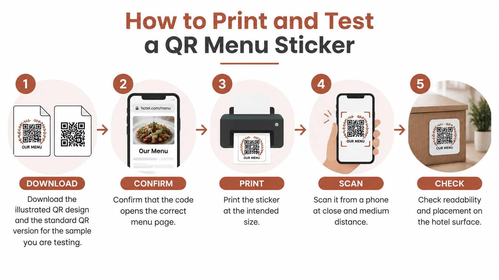
The visual sequence below summarizes the production process. The numbered checks add the details needed before placing a sticker in guest areas.
Test the actual printed object
Download the matching designs. Select the illustrated QR PNG and the standard QR PNG for the same sample. Mixing downloads from different venue categories makes comparisons unreliable because the destination may change along with the artwork.
Confirm the destination before production. Open both codes and check that each reaches the intended public sample menu. A successful scan of the wrong menu is still a failed check, so confirm the venue identity and content, not merely that a page appears.
Print at the intended size. Produce the actual table-sticker or counter-card layout rather than judging an enlarged image on a monitor. Include the planned paper or label stock and finish, since a screen preview doesn't reproduce the finished surface.
Protect the quiet zone. Keep the clear border around the code free from artwork, captions and sticker edges. A cropped border can prevent scanning, so decorative framing should sit outside that clear area.
Try several phones under normal lighting. Include an older model when available, and scan from the positions guests are likely to use. Glossy finishes can create glare under bright lights, so a print that works beside a window may still need adjustment beneath a ceiling fitting.
Check seated visibility and reach. Position the sticker where a seated guest can see and scan it easily, such as the face of a table stand. Avoid hiding it against the edge of a menu holder or placing it where glasses, condiments or place settings routinely cover it.
Repeat after production changes. Recheck after a reprint, paper change or move to another surface. Staff shouldn't assume that an earlier successful test applies to a smaller print or a differently lit location.
Understand what the download demonstrates
The downloadable PNGs on qrmenu.design provide an illustrated QR and a plain QR for the same public sample. Both open that sample only, not the operator's own menu, existing URL, ordering system, payment account, POS or analytics platform.
Dish names and prices are fictional examples. The custom menu maker is still in development, so creating, editing and publishing an operator's own menu aren't currently available.
Pass condition: Every test phone opens the intended menu on the first scan under the planned venue conditions.
That is an acceptance target for the print test, not a claim about guaranteed results. If a phone struggles, staff should adjust the print, finish or placement and repeat the check before producing the full batch.
Room Service Prices Choices and Label Rules
In September 2024, 35% of surveyed British hotel guests considered room service too expensive and 26% complained about limited options, according to the Zonal and CGA by NIQ Go Technology report, reported by The Caterer in 2025. These findings point to distinct problems: guests need to understand the cost, and they need a useful choice within the kitchen's capacity.
A longer list isn't automatically the answer. A short room-service card can work well when the dishes travel sensibly, the hours are clear and guests can see what remains available overnight.
Build a card around the service
The card should identify:
- Availability: State service hours and distinguish the overnight offer from the main menu.
- Delivery expectations: Give a realistic delivery-time note and explain how staff communicate delays.
- Complete cost: Show dish prices alongside applicable delivery charges and other mandatory costs.
- Kitchen limits: Identify dishes or substitutions that stop when the main kitchen closes.
A fictional illustration, not a rate recommendation, might show soup at 9 and a main course at 24, with a currency label and an explicit delivery-charge note. Those example prices only demonstrate how a card can present information; they aren't hotel-market benchmarks.
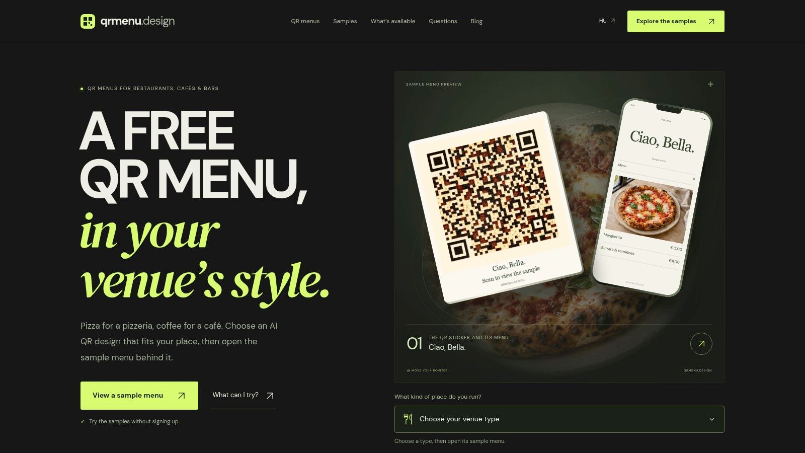
This screenshot illustrates a sample presentation rather than a live hotel offer.
Check the applicable labeling rules
The FDA's restaurant nutrition-labeling guidance explains calorie-disclosure requirements for covered U.S. chain restaurants and similar retail food establishments, with separate provisions for certain vending machines; it also identifies January 1, 2024 as the uniform compliance date for relevant final food-labeling regulations issued in 2021 and 2022. That date shouldn't be treated as a universal starting date for every menu-labeling obligation.
Independent hotels, cafés, bars and food trucks shouldn't assume identical coverage. Operators should check the rules applying to their location and business before publishing nutrition or allergen statements.
The room-service card should name main ingredients, distinguish preferences from medical allergies and direct severe-allergy questions to staff. Labels must describe the kitchen's real preparation practices, not merely the intended recipe.
qrmenu.design offers free sample menus and downloadable QR designs that let hotel operators compare browser layouts and test printed access without signing up. A visit to qrmenu.design provides a low-pressure way to explore hotel and restaurant examples before planning a property's own menu presentation.