Digital Menu QR Code: How It Works and What to Check
Learn how a digital menu QR code works for guests, what to test before printing, and when a QR menu fits your venue.
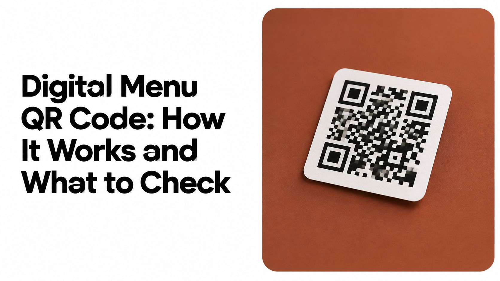
A party of four sits down at 7pm. Someone asks whether the drinks list is online, and a server explains that the printed list is two price changes out of date. That's usually the moment an owner starts looking at a small square sticker on the table.
A digital menu QR code looks like a small project. It isn't, because it fails in small ways. Four things have to work in sequence: the printed sticker, the phone camera, the browser page and the guest's patience. Get three of them right and the fourth will still find a way to misbehave on a Friday night.
The decisions that matter are practical ones. Where the sticker lives, how it's printed, what the page does on a weak signal, and what happens when a guest would rather hold paper.
What a Digital Menu QR Code Is
A digital menu QR code is a two-dimensional pattern that a phone camera converts into a web address. Denso Wave designed the format in Japan in 1994 for production control of auto parts, where one-dimensional barcodes held too little information and had to be scanned repeatedly, and the two-dimensional layout let a reader capture data quickly from any orientation. That last property is the one guests benefit from: nobody has to line up a perfect shot.
The clearest way to hold the idea is an address analogy. The sticker is the street address, the menu is the house, and you can renovate the house without touching the address. Change a price, drop a sold-out dish, add a seasonal category, and the printed square still points where it always pointed.
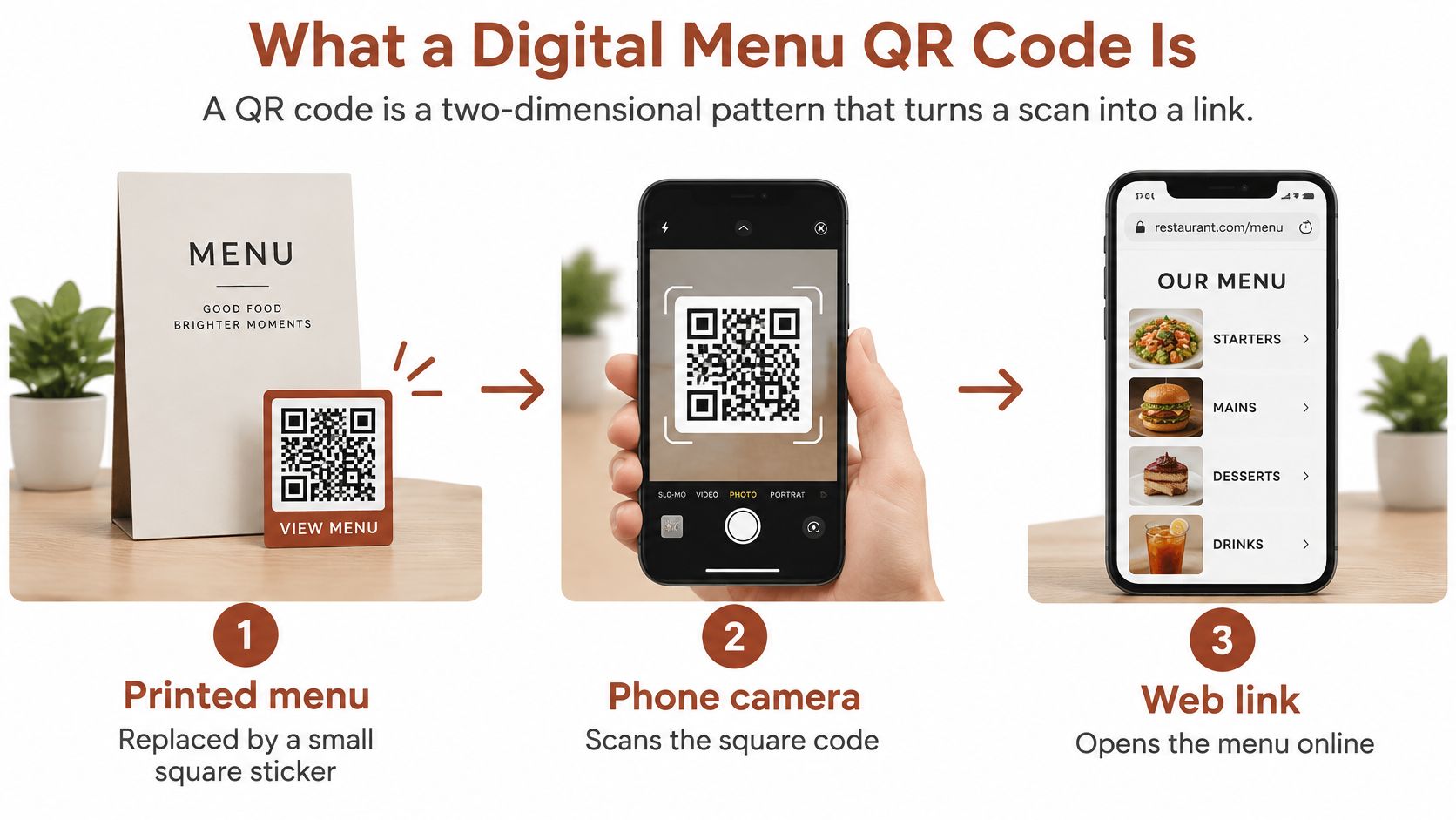
What a venue gains is narrower than the marketing suggests, but real:
- Fewer reprints. A price change becomes a page edit, not a print order.
- The guest's own device. Guests read the menu on the screen they already know, at the text size they've set.
- No app, no account. The camera reads the square, the browser opens the page, and nothing gets installed.
One limit is worth stating plainly. The code is a delivery route, not a better menu. It won't rescue a cramped layout, a slow page or a category order that makes no sense to a hungry guest.
From there the questions run in order: how a guest scans, where that path breaks, how the code gets chosen and printed, and whether a QR menu suits the room at all.
How Guests Scan and Reach the Menu
When the route works, the guest barely notices it. That is the goal: a printed square, a phone already in hand, and a browser page that opens where the sticker promised.
- Open the camera. Current phones read QR codes from the built-in camera, so the menu arrives without an app install or an account.
- Point from the seat. The code needs to fill a reasonable share of the frame. A small sticker across a wide table, or one turned toward the aisle, gives the phone nothing to work with.
- Tap the link the phone offers. The camera recognizes the pattern and shows a notification or button. One tap hands the address to the browser.
- Read the menu as a web page. Categories, descriptions and prices arrive on a page sized for a phone screen.
- Close the tab when finished. Nothing follows the guest after the meal.
The route has four parts: the printed sticker, the guest's phone, the link inside the code and the page that loads. The handoff between them is the part operators underestimate. The code carries a web address and the browser does the rest, so that address should be a stable HTTPS link that opens without an app install or an account and stays valid for as long as the stickers stay on the tables. Timed sessions defeat that. A link that expires or a session that resets midway can frustrate a guest who has not finished reading, and the table has no obvious way back to the menu.
Where the Path Breaks
Distance is the first break. A sticker sized for a phone held close to it is unreadable from across a table, and a sticker tucked behind the napkin holder is unreadable at any distance.
Glare is the second. Gloss laminate under a pendant light turns black modules into a white reflection at exactly the angle a seated guest uses.
A code that scans cleanly in a design file and fails under a pendant light hasn't been tested. It's been photographed.
A slow page is the third. A menu that takes too long to show its first category sends guests back to a paper list or a guess.
The wrong page is the fourth, and the most common. A redirect that lands on a homepage, a stale weekend menu or any screen that is not the menu breaks the whole transaction. Operators run into the same friction from their side: a 2025 qualitative study of restaurant operators identified connectivity problems, outdated mobile devices, device compatibility, usability and reliability as disadvantages of QR menus (2025 qualitative study of restaurant operators).
Placement closes the loop. A seated guest needs the square in clear view, within easy camera reach, and not competing with a candle, a table number or a condiment caddy. Treat position as part of the service. And because any link in this chain can fail on a busy night, keep a fallback within reach: a paper menu the server can hand over, or a staff member who can pull the menu up on a house device.
Permissions, Privacy and Trust When Guests Scan
A guest lifts the phone, the camera opens, and the page either behaves like a menu or starts asking for things a menu does not need. That first moment is part of the route: sticker, browser, phone, and a paper fallback if any link fails.
Before printing, check these five things on the exact link the sticker will carry:
- Direct arrival. The link opens the intended menu page immediately, with no sign-in, account or app-install prompt in the way.
- No permission requests. The browser does not ask for location, contacts or notifications just to show a dish list.
- Matching address. The browser bar matches the readable address printed beside the code, so guests can see where they landed.
- No payment fields. A menu page never asks for card details.
- Known redirects. Any redirect or tracking parameter is one the venue can name and explain.
A checklist sounds heavy for a square of plastic, but trust is mostly risk felt in the hand. In a 2025 study of 525 diners on electronic service quality, perceived risk significantly affected electronic service quality, while the authors noted that privacy and payment-security dimensions were not fully examined. The same research describes privacy risk as fear of unauthorized disclosure of personal information.
A fast load is only half the job. The qrmenu.design samples are fictional venues with example dishes and prices, which makes them useful for judging what guests should meet: a readable menu in the browser, reached by camera scan, with no app or account. If a guest still hesitates, label the destination plainly beside the sticker and keep a printed menu within reach.
Choosing Error Correction and Code Size
Error correction decides whether a scuffed sticker still works. The format stores spare copies of its own data, and the level you pick sets how much spare data exists. The four standard Reed-Solomon levels restore roughly 7%, 15%, 25% and 30% of codewords respectively, and Denso Wave's explanation of QR error correction frames the choice as a balance between reliability and the symbol size the job can afford.
| Level | Codewords restored (approx.) | Suits a menu sticker when |
|---|---|---|
| L | about 7% | the sticker is protected and no artwork sits near the code |
| M | about 15% | the sticker gets normal handling (recommended baseline) |
| Q | about 25% | artwork sits close to the code or the sticker may wear |
| H | about 30% | conditions are harsh, but the pattern becomes denser and larger |
Why the Percentage Isn't a Guarantee
Think of a torn banknote. The spare data lets a scanner rebuild what's missing, but only while enough of the important pieces survive. Damage location, module geometry, contrast, blur and the integrity of the three large corner squares all affect decoding.
A thumbprint over one finder pattern can stop a scan while covering a small fraction of the total area. A clean 25% of missing modules spread across the middle may scan without complaint. The percentage describes redundancy, not a licence to cover a quarter of the square.
The trade-off is space. More redundancy means a denser pattern for the same web address, which needs a larger printed square to stay readable at table distance. Pushing to Level H and keeping the sticker the same size is how operators end up with a code that fails in the field.
Practical rules that hold up:
- Keep the payload short. A compact HTTPS address, not menu text or a long campaign string.
- Hold contrast. Dark modules on a light background, no metallic or pastel inks.
- Never cover modules. No logo stamped over the middle, no artwork bleeding into the pattern.
- Prove the size on paper. Print at final dimensions and scan from guest distance.
Practical rule: choose the lowest level that survives your real conditions, whether that's handling, condensation or food residue, then confirm the choice on a printed proof rather than on screen.
Design Choices That Keep the Code Readable
Start with the empty space, because that's what most artwork breaks. The GS1 2D Barcode Colour & Quality Guide defines the quiet zone as the blank area surrounding all four sides of a two-dimensional barcode, and states that a QR code needs a minimum quiet zone of 4 X-dimensions on every side. The same guide warns that removing that space, or letting graphics, colours or other printed elements sit inside it, can reduce reading performance.
In plain terms, the quiet zone is four modules of nothing on each side. It looks like wasted space and it isn't.
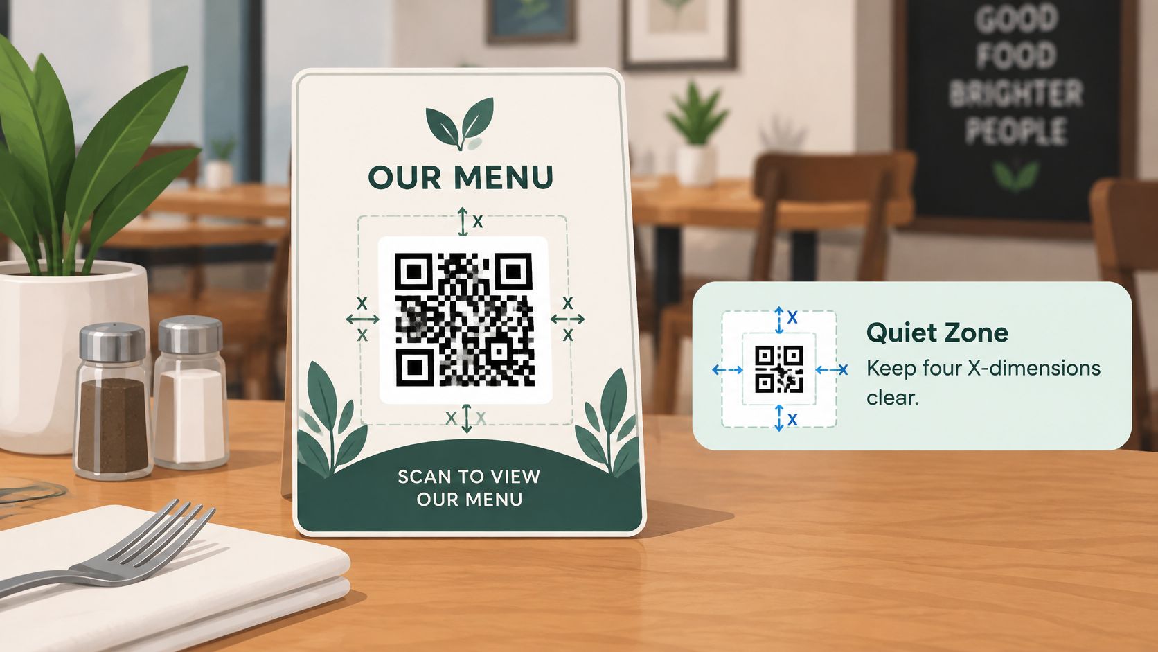
Artwork Belongs Outside the Border
Illustration earns its place when it tells a guest which menu they're about to open. A pizza motif suits a pizzeria, coffee imagery suits a café, and cocktail artwork suits a bar, as long as every one of those sits outside the quiet zone rather than across it.
Comparing the two download types is useful. An illustrated AI sticker fits a venue's identity; a conventional black-and-white code is simpler to check, photocopy and reproduce when you need 40 of them by Thursday. Both routes work, and the illustrated one only works if the decoration stays subordinate to the pattern.
Contrast is the next rule. Dark modules need a light background, printed at full density. Low-contrast colour pairings, metallic inks and laminated surfaces that throw reflections all cost reading performance in real rooms.
Size comes third. The square has to be large enough for the distance a seated guest scans from, which is further than the distance you test at when you hold a proof in your hand. A counter card read from 40 cm and a wall sign read from three metres need different dimensions.
If the artwork were peeled away, the code should still sit in a clean, empty square with a clear border. If it doesn't, the design is doing the code harm.
How to Test a Printed Sticker Before You Print in Bulk
A screen preview proves nothing about a printed sticker. Ink, paper, laminate, curvature and room lighting are all part of the specification, and the only honest test happens on a physical sample. Technical guidance recommends checking a physical print with at least three different mobile devices and, where reliability requirements are high, using an ISO/IEC 15415 verifier (QR printing guidance from Aria).
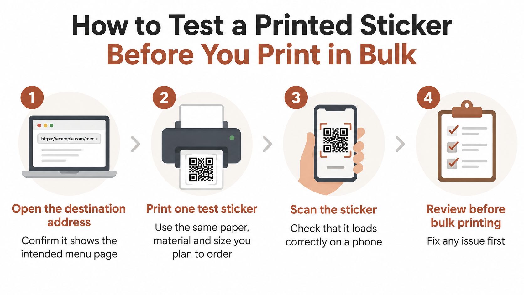
The sequence below takes about half an hour and saves a print run.
- Open the destination address in a browser first. Confirming the page shows the intended menu means a later failure is a printing problem, not a link problem.
- Print one test sticker on the actual stock. Same paper, same laminate, same size as the final order, because a matte proof won't predict a gloss sticker under a pendant light.
- Check the border. At least four times the width of a single module of clear space on all four sides, with nothing printed inside it.
- Scan with at least three phones. Include an iPhone and an Android device if the venue's guests use both, since camera software varies.
- Scan from guest distance and angle. On the actual table surface, seated, in both dim evening light and bright midday light.
- Confirm every scan opens the same page. Then repeat one scan on mobile data rather than venue Wi-Fi, because guests arrive on their own network.
The Slips That Cause Reprints
Three mistakes account for most bad batches. Screen-only testing skips the production variables entirely. Single-phone testing hides compatibility problems that show up on the second device. Close-range testing flatters a code that no seated guest will ever scan that closely.
There's a fourth, subtler one. Downloadable samples are demonstrations, so the destination is the matching sample menu that goes with that QR design, not your own menu, an existing URL, an ordering system or a payment page. A test should confirm both halves: the camera reads the printed code, and the browser shows the intended sample. Menu layouts vary by concept as much as codes do, and a juice bar menu design leans on short category names and fast scanning, so the printed test is what proves the sticker reaches that page rather than a stale one.
The pass rule is blunt: every phone opens the right page on the first or second try. If one device fails, adjust size, border or error correction level, print a fresh test and scan again. Keep the approved sheet with the final print order so the printer has a reference that already worked in your room.
Venue Examples From Pizzeria to Food Truck
Placement and menu structure shift with the venue. The examples below are illustrative rather than descriptions of real businesses, and each one assumes the same sequence: pick the venue type, open its menu, then test the print.
| Venue | Likely sticker placement | Menu area to check | Printing check |
|---|---|---|---|
| Pizzeria | Table tent or table sticker | Sizes, toppings, prices | Scan from a seated distance |
| Café | Table sticker and counter card | Drinks, bakery, breakfast | Keep the border clear of illustration |
| Bar | Table sticker and menu board | Short category list, cocktails | Test in dim light |
| Hotel restaurant | Breakfast table and in-room card | Breakfast, room service, dinner | Test on several phones and lighting |
| Food truck | Window sign and picnic-table sticker | Short menu, clear prices | Test outdoors in sun and glare |
A pizzeria has the advantage of a menu guests already understand. The check is whether sizes, toppings and prices are findable in a couple of taps, because a table tent gets scanned by four people who each want to know one thing quickly.
A café handles the hardest conditions: a queue at 8:15am. A table sticker for seated guests and a counter card for the takeaway line serve different moments, and both need drinks and bakery categories within one tap. Ideas for structuring that page sit in this café menu design guide, and the printing check here is keeping decoration clear of the code's border.
In a bar, the code competes with low light and one-handed scanning. Short categories beat long descriptions, and the sticker should be tested at the actual bar height, not on a desk.
A bar usually pairs a table sticker with a menu board, so the short category list and the cocktail section carry the load. A hotel restaurant works across two rooms and two times of day: breakfast tables and in-room cards, which means breakfast, room service and dinner each need their own clear section.
A food truck gets the least forgiving test of all. Sun, glare and a queue mean a window sign plus a picnic-table sticker, a short menu with prices visible without scrolling, and a scan check at the actual pitch at midday. Choosing a venue type changes both the QR artwork and the sample menu that opens, so match the sample to the venue before judging the layout.
Menu Usability and Access on Guests' Phones
The code gets the guest to a page. The page decides whether the visit works. A menu published as a PDF or a shrunken photograph forces pinching, sideways scrolling and guessing, and no amount of sticker polish rescues that.
The format question has been studied more than most. A 2025 systematic literature review screened 482 papers and selected 18 studies on digital restaurant menus, finding touchscreen menus to be the most prevalent format because they offer interactivity and user control, and identifying menu responsiveness as a management challenge (the 2025 systematic review of digital restaurant menus). Responsiveness is the part an operator can check in five minutes on their own phone.
Open the sample menu and test each of these:
- One-tap categories. Every category opens on a single tap, with no hover menus or nested lists.
- Readable text. Dish names and prices are legible without pinch-zooming.
- Scannable descriptions. Descriptions stay to a line or two so a guest can decide quickly.
- Visible prices. Prices show without scrolling sideways or hunting.
- Portrait first. The whole page works in portrait orientation, since that's how a phone is held at a table.
Then run a connection check. Load the page on a weak mobile signal and note how long it takes before the first category appears. That delay, not the scan, is what guests experience as the menu being broken.
Accessibility deserves a test rather than a claim. A 2025 study involving 10 blind participants found its AccessMenu prototype outperformed a state-of-the-art comparison solution in usability and task workload through easier navigation and query-based filtering (the 2025 accessible-menu study). That doesn't establish that any particular digital menu is accessible, so check the basics yourself: clear headings, sensible reading order, strong contrast and controls that assistive technology can reach.
Worth stating plainly: the qrmenu.design samples are fictional venues with example dishes, illustrative prices and AI-generated food photographs. The test is navigation and presentation, not a real offer. Hotel operators comparing formats can see how a full dinner list behaves on a phone in this hotel menu design guide. Finish by writing down the two or three points where a guest would hesitate. Those decide whether the page works.
Decide Whether a QR Menu Fits Your Venue
A QR code is only a route to a page. Whether it works at your tables depends on a short chain: the printed sticker, the browser menu it opens, the guest's phone, and the fallback for when one link fails. Decide on the chain first and the design questions become easy.
Diner preference is the first reality check. US Foods' 2024 Diner Dispatch Survey reported that 90% of surveyed U.S. diners preferred printed menus over QR-code menus, up from 74% in 2023 (US Foods' 2024 Diner Dispatch Survey).
Willingness to scan and willingness to replace paper are different things. The National Restaurant Association's 2024 technology research found that 59% of full-service customers would use a QR code to open a menu on a smartphone, while only 48% would feel comfortable using one to place an order (Toast's summary of the National Restaurant Association technology research). These surveys polled different U.S. samples with different wording, so read them as one signal: the code earns its place alongside printed menus, and some share of guests will always want the paper version.
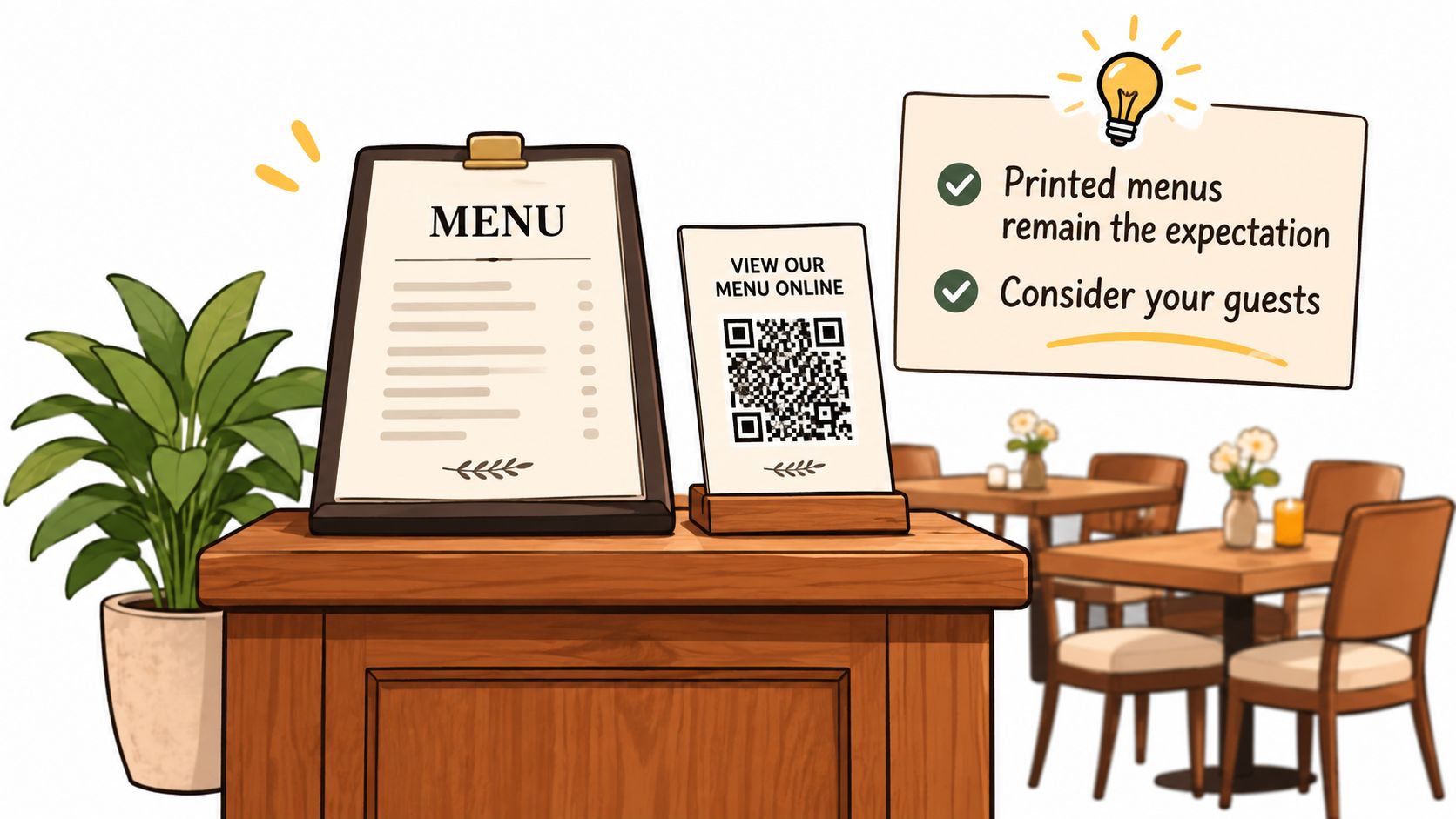
The Backup Plan Comes Before the Design
A browser menu shifts part of the technical responsibility from the venue to the guest, and some guests can't carry it: an old phone, a flat battery, no data signal, a visual impairment, or a simple preference for paper. The fallback plan is short and cheap.
- Keep printed menus at the counter and offer one without being asked.
- Print the menu address in readable text beside the code, so anyone can type it.
- Brief staff on helping a guest who can't scan, including where the paper copies live.
- Check the venue's own connection in the dining room, where signal is weakest, instead of at the office desk.
- Test on an older phone as well as a current one.
A Four-Step Decision Path
- Try the sample menus by venue type. qrmenu.design offers free sample menus across 36 venue types with no sign-up, and choosing a type changes both the QR artwork and the menu that opens.
- Print one test sticker, confirm it opens the right menu, and scan it on more than one phone, following the testing sequence described earlier before any bulk order.
- Write the fallback plan for guests who can't scan or hit a weak signal.
- Decide, then choose the design. Once the access question is settled, picking between an illustrated sticker and a plain code is a quick call.
Be clear about what the site does today. Visitors can open sample menus and download QR designs linked to those samples, in an illustrated AI version and a conventional black-and-white version. Creating and publishing your own menu and generating custom AI QR artwork aren't available yet. A menu maker that will handle publishing, custom artwork and existing menu links is in development and is planned to be free. For now the site is a place to test the guest experience end to end, which is exactly what this decision needs.
If you want to see how the printed square and the browser page work together before committing to a print run, qrmenu.design publishes free sample menus across 36 venue types, each paired with downloadable PNG artwork in an illustrated AI version and a conventional black-and-white version, and both open the matching sample menu. Pick the venue closest to yours, scan it from your own table, and judge the experience on a phone held at dining height. Explore the samples and downloads at qrmenu.design.