Juice Bar Menu Design for Easy Phone Browsing
Plan a juice bar menu design guests can scan on a phone: drink groups, sizes, prices, quiet-zone QR tests, and a printed fallback.
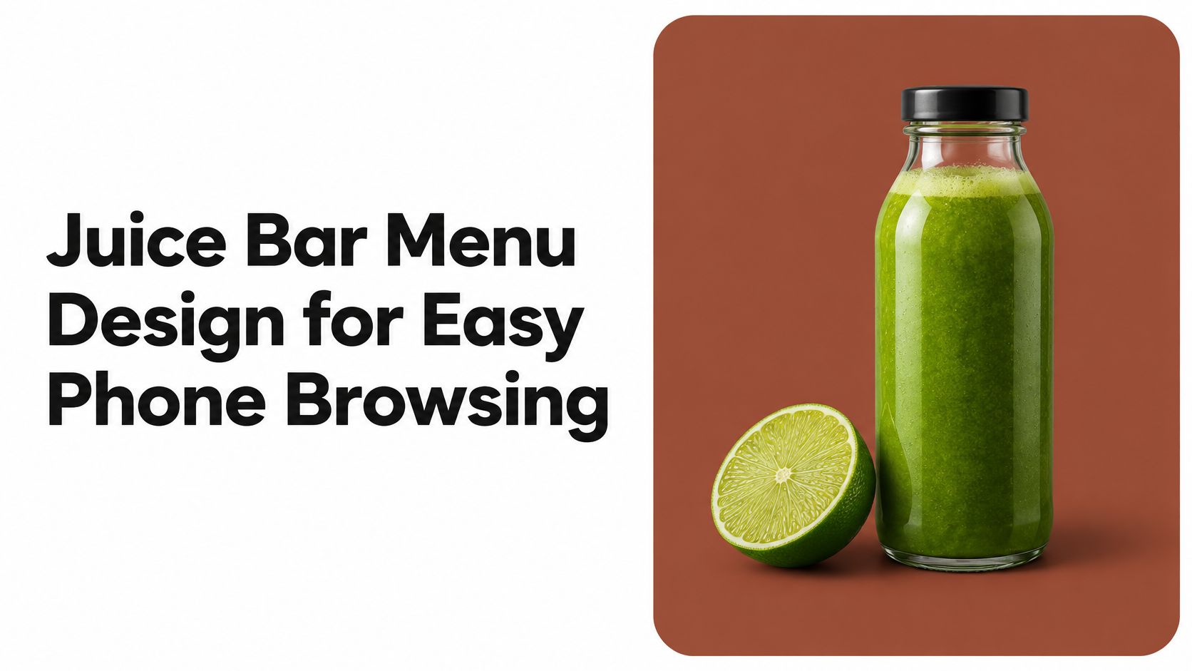
Lunch service is twenty minutes away. A guest sits down, holds a phone camera over the sticker on the table, and starts reading. The first screen is a photograph of a green drink with a hashtag under it. The second is a paragraph about cold pressing. Around the third screen she gives up and asks the counter what the green one tastes like and whether there's a large.
That moment is the whole job. Juice bar menu design earns its keep with a fixed reading order on a small screen, a sticker that scans, and a fallback for the guest who can't or won't use a phone. Colour and type matter, but they come after the order.
One rule runs through everything below. Every drink carries the same four pieces of information in the same sequence, whether it appears on a phone, a printed card or a chalkboard: name, ingredients, size, price.
A Clear Layout for Juice Bar Menus
Start with the reading order, not the artwork. Someone reading a juice list on a phone is doing one task: what is it, what's in it, how big, how much. When those answers sit in the same place on every row, the menu stops being a reading exercise.
Six Blocks in Serving Order
Set the blocks in this order and keep them stable week to week: signature juices, green and vegetable, citrus and fruit, smoothies, wellness shots, then a short seasonal row. The first block carries the drinks you want ordered. The middle two separate a green drink from a fruit drink, which matters more than most operators expect, because a guest who wants sweet won't read through a wall of kale to find it. Shots sit after smoothies so nobody mistakes a 2 oz ginger hit for a full drink.
The seasonal row is last and short on purpose. It leaves the menu when the fruit runs out, not three weeks later with a small sold-out tag beside it. Operators moving from breakfast service into juice tend to carry over category habits from a café list, and the ordering logic in these café menu ideas transfers directly once you swap dishes for drinks.
Name First, Ingredients Second
Every drink gets a name on its own line. The next line lists what's in it, in the order you taste it: kale, apple, lemon, ginger. Leave out phrases like "a revitalising blend designed to support your morning." Ingredient order answers the question a guest is asking, which is whether the first mouthful will be sharp or sweet.
| Menu block | Guest sees first | Sizes to show | Price placement | Optional detail |
|---|---|---|---|---|
| Signature juices | Drink name, then main ingredients in tasting order | Two sizes only if both are sold daily | Same line as the name | Calories in the same style as the price |
| Green and vegetable | Name plus the vegetable-forward ingredients | Two sizes only if both are sold daily | Same line as the name | A short contains note when a common allergen is in the recipe |
| Citrus and fruit | Name and the fruit list | Two sizes only if both are sold daily | Same line as the name | Pulp or no-pulp, if it changes the drink |
| Smoothies | Name, base, and one add-in | One house size | Same line, or directly under the name if the line wraps | Dairy or protein note when the base is not obvious |
| Wellness shots | Name and three ingredients | One small size | One price only | Spice level, not a health claim |
| Seasonal or limited | Name and the ingredient that is in season | One size | Price with the last service day in the description | Remove the row when that ingredient runs out |
Sizes and Prices
Pressed juice shows two sizes only when both are sold every day. A 12 oz that exists on Saturdays confuses the Tuesday guest and starts a conversation at the till. Smoothies use one house size. Shots use one small size and one price, because nobody wants to choose between two thimbles. Put each price on the same line as the drink name.
If calories appear on the menu, give them the same visual weight as the price rather than a footnote at the bottom of the page. The USDA Economic Research Service describes the FDA's 2014 menu-labeling rule, which requires chain restaurants and similar food-service businesses with 20 or more locations nationwide to display calorie information in a font and format comparable to the item's name or price. An independent juice bar isn't the target of that rule, so read it as a design reference and check what applies in your area.
Guests have grown used to seeing numbers beside the items they order. The design point is simple: numbers beside the name read as competence, numbers buried at the bottom read as a shrug.
Layout rule: the drink name owns the first line of every row. Nothing sits above it, not a badge, not an icon, not a slogan.
Copy the table into a draft and delete any block you don't sell. A bar with no shots ends up with five blocks. A food truck with three juices ends up with two. Order matters more than count.
How to Line Up Drinks Ingredients Sizes and Prices
Lining up means one thing: the same four facts in the same order on every row. The fastest way to see whether a draft does that is to build four rows by hand and look at them together. Every price below is a fictional example, not a market rate.
Start with Four Fictional Drinks
| Drink | Ingredients, in tasting order | Sizes | Fictional price |
|---|---|---|---|
| Green Day | kale, apple, lemon, ginger | 12 oz and 16 oz | $8.00 and $10.50 |
| Citrus Press | orange, grapefruit, lemon | 12 oz and 16 oz | $7.50 and $9.75 |
| Berry Oat | strawberry, blueberry, oat base | 16 oz | $10.00 |
| Ginger Shot | ginger, lemon, cayenne | 2 oz | $3.75 |
The chart below shows the same four rows arranged for a phone screen.
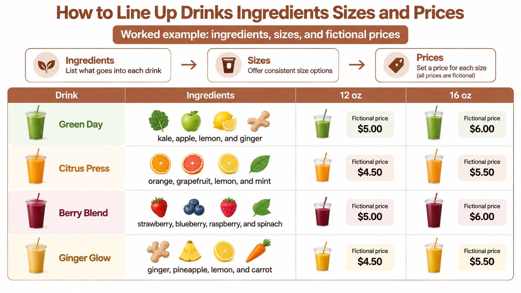
The Eight Steps in Order
List only what's sold today. Green Day is on the board because kale arrived this morning. If the delivery failed, the drink comes off and that block runs three rows long. A menu of things a guest can't order trains people to ask instead of read.
Sort each drink into one block. Green Day belongs in green and vegetable, Citrus Press in citrus and fruit, Berry Oat in smoothies, Ginger Shot in wellness shots. Around seven rows per block is the practical ceiling; past that the eye slides off and the questions start.
Write ingredients in tasting order, about eight words maximum. "kale, apple, lemon, ginger" is four. When a line runs long, either the recipe is doing too much or the description is.
Attach sizes by the layout rules. Two sizes for Green Day and Citrus Press because both are pressed daily, one for Berry Oat, one small for the shot. If the 16 oz Green Day only exists on weekends, it doesn't belong in the row.
Put one price per size on the name line, in one currency format. If Green Day reads "$8.00 and $10.50", every two-size drink reads that way. No row should say "8" while the next says "$8.00".
Add calories or a contains note only when the figure is real for that recipe. An invented number on a smoothie is worse than no number, because a guest will order around it and never tell you why.
Read the list aloud once. Name, ingredients, size, price. Green Day, kale apple lemon ginger, twelve or sixteen, eight or ten fifty. If a line needs a story to make sense, the story is the problem.
Collect modifiers at the bottom. No ginger, no cayenne, oat milk instead of the oat base: one short note under the list beats repeating the same line four times.
If a line needs a story to make sense, cut the story.
Where a Price Lands When the Line Wraps
On a narrow phone, "Berry Oat" plus ingredients plus "$10.00" won't always fit on one line. Let the price drop directly under the name rather than pushing it to the right edge of a wrapped sentence, where it floats away from the drink it belongs to. Keep each drink in its own block so the drop is obvious.
Check the Green Day row against your own draft. Could a stranger tell what's in it, which sizes exist, and what each one costs, without reading anything else? If not, the row isn't finished.
Phone Type Contrast and Tap Targets
A menu opened from a sticker on the table is a touch screen, not a desktop page. The guest is holding the phone one-handed at arm's length, in your lighting, possibly with a drink already in the other hand. Design for the thumb and the rest follows.
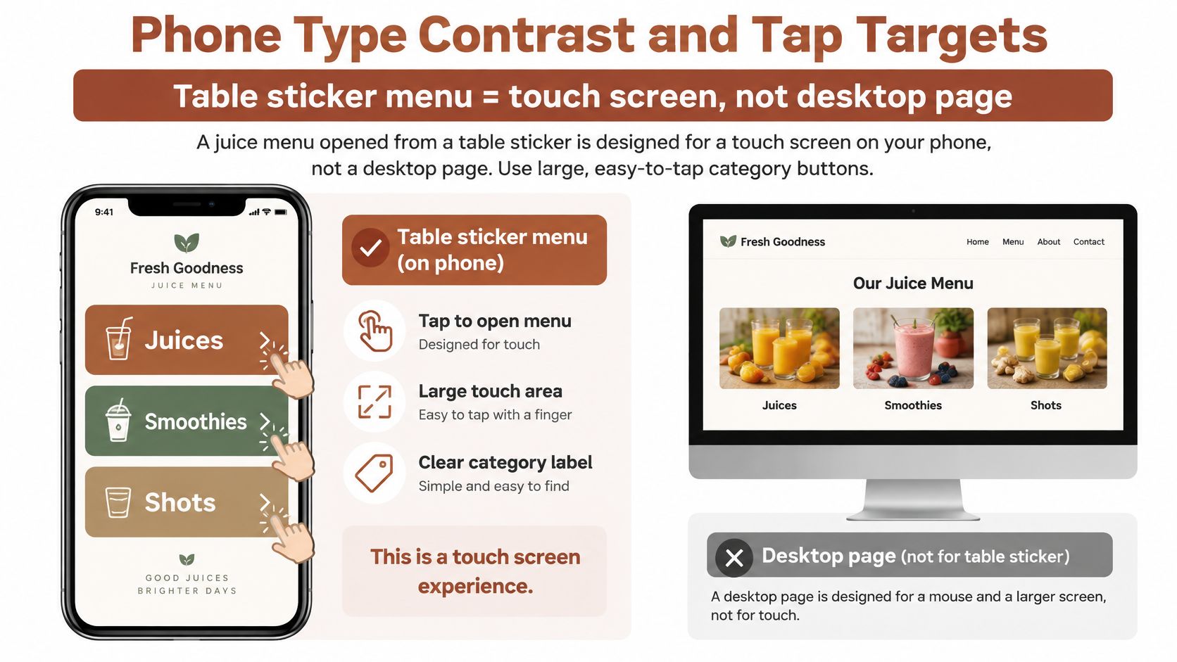
Category Labels Are Buttons
Use short labels: Juices, Smoothies, Shots, Seasonal. Each one needs to look tappable and be big enough to hit without aiming. Nielsen Norman Group's mobile usability guidance recommends click-activated submenus because hover is unavailable to touchscreen users and keyboard users, and it notes that limited screen space makes mobile navigation difficult. That's the argument against hiding your only path to the drinks inside a hamburger menu on a four-category list.
- One tap to a category. If Smoothies takes two taps and a scroll, the layout is doing work the guest didn't ask for.
- No hover-only reveals. Anything that appears on hover never appears on a phone.
- No icon-only navigation. A juice glass with no word under it is a puzzle, not a label.
Type You Can Read at Arm's Length
Body text needs size and contrast: dark text on a light background, or the reverse, and neither at 60% opacity. Price and ingredient text never sits over a photo, because a picture behind a number forces the guest to hunt for the thing they came for. Keep the category list visible or one tap from the top, and don't stack your drink names inside a carousel that swipes away mid-read.
A guest points their phone camera at the table sticker and the menu opens in the browser. No app install, no account, no password. Every extra step you add is a reason to put the phone down and ask.
Spacing Between Drinks and Between Prices
Give each drink its own block, with real space between one price and the next so a thumb doesn't land on the wrong size. Stacked size prices are safer than a tight side-by-side row. Skip carousels and auto-rotating banners for the core list, since a swipe or a timer can carry a guest away from the row they were reading.
Tap test: a guest should reach any drink in two taps and never need to zoom to read a price.
Try the draft on a phone at the table, not at your desk. Can a guest reach Smoothies in one tap and read the shot price without pinching the screen?
Test the Quiet Zone Before You Print
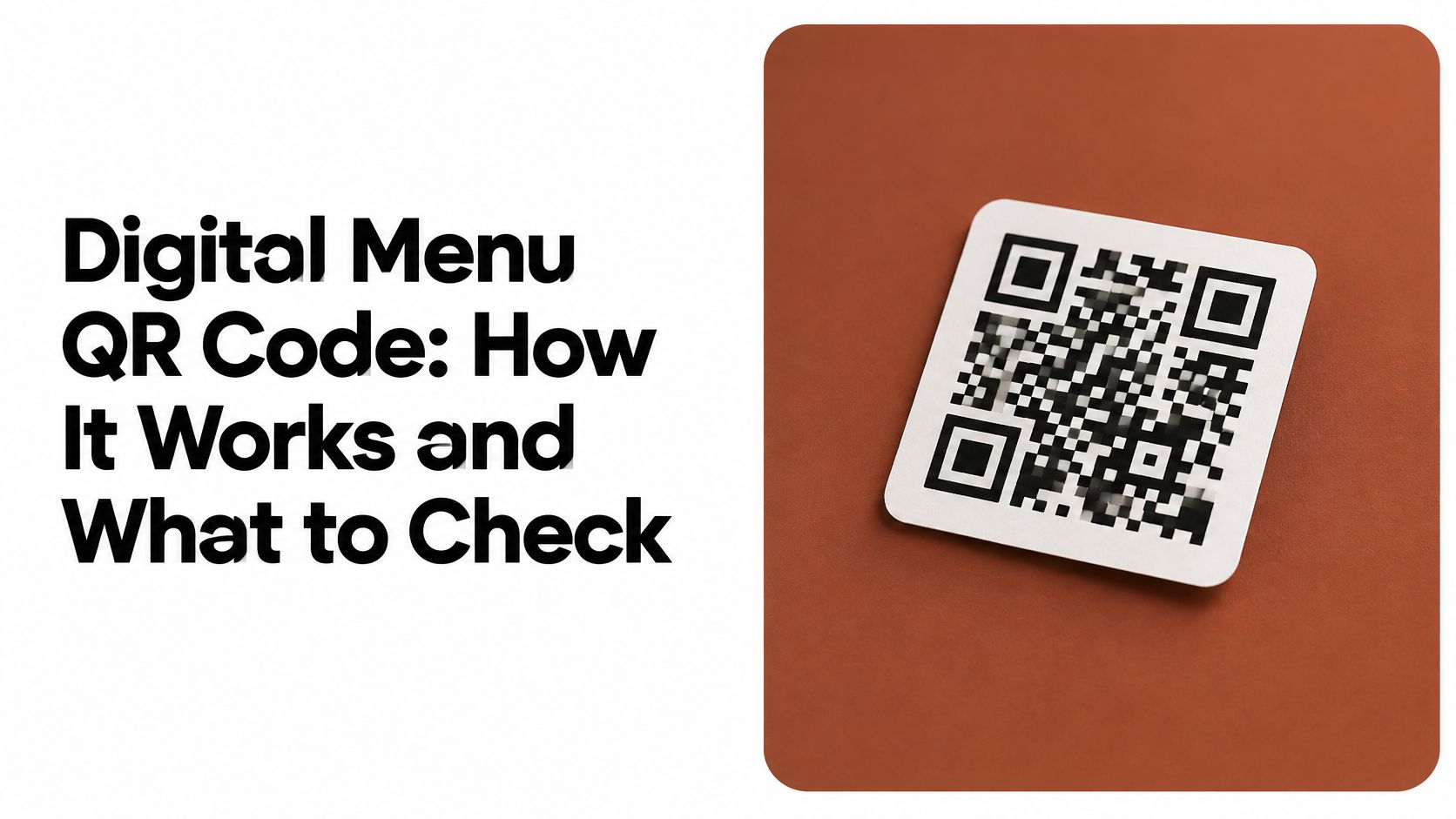
The sticker looks sharp on a laptop. A lime wedge tucks into the bottom corner of the code, the bar name curves above it, and the whole thing sits on a soft green background. On the table it fails. Three phones in a row won't read it, and the guest tries twice before asking for a printed menu. Nothing is wrong with the artwork except the space it occupies.
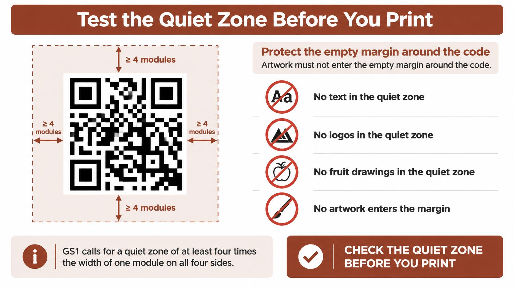
The Margin Is Part of the Code
A QR code needs an unobstructed quiet zone on all four sides. GS1's guidance on 2D barcode verification specifies a quiet zone of at least four times the symbol's X-dimension, meaning the width of one individual module in the code. That area must stay free of text, graphics and other printed elements so a scanner can locate the finder pattern.
Illustrated artwork is where this goes wrong most often. Fruit drawings, logos, decorative borders and background patterns drift into the margin because the margin looks like empty space to a designer and like part of the code to a scanner.
Print check: look at the sticker and ask whether anything, including the background, sits within four module widths of the code on every side.
The Print Test in Six Steps
- Download the design you intend to use.
- Confirm the destination. The code must open the matching public menu, not a different sample.
- Print at the physical size guests will see, not a shrunken proof on office paper.
- Scan the paper copy rather than trusting the on-screen preview.
- Repeat on more than one phone, in the venue's real light, from the distance of a seated guest.
- Keep the clear border in the final trim, after cutting.
Then placement. Put the sticker where a seated guest can see and reach it: the table edge, a counter card, a menu stand. Not under a napkin stack, not flat beneath a candle holder, not on a curved surface that distorts the print.
There's no single millimetre size to promise, because GS1 states that required barcode size depends on the code itself, its information density, the printing method, the material and the scanning distance. Test at the size you'll print. The sample downloads at qrmenu.design pair an illustrated sticker with a plain code, and both open the same sample menu rather than an operator's own list.
Four Failures and the Fix
| What happens | Likely cause | What to change |
|---|---|---|
| The phone will not find the code | Artwork, type, or a border sits inside the quiet zone | Reprint with an empty margin of at least four module widths on every side |
| The screen preview works and the paper copy does not | The print is too small, low contrast, or glossy under the venue lights | Print at the intended size and scan the paper in that lighting |
| The code opens the wrong menu | The file is a different sample from the one that was checked | Open the link before printing and match the sticker to that menu |
| A seated guest cannot get a read | The sticker is too far, folded, or covered | Move it to the table edge or counter card and test from a seated reach |
When a Guest Cannot Scan the Code
A couple sits down and shares one phone. The battery is at 9%, the data plan is nearly spent, and neither of them wants to hold a camera over a sticker in a busy room. Or a regular has an older handset that reads codes slowly in low light. Or a guest doesn't like scanning and would rather ask a person.
Every one of those guests still wants a green juice.
A polished QR menu lowers service when it assumes a recent phone, a strong signal, sharp eyesight and comfort with scanning. Research on digital menu use identifies the recurring barriers: internet dependence, device compatibility, difficult navigation, loading problems, unreadable codes, and greater difficulty among older users. The same work, drawing on 844 QR-menu users, found that information quality and system reliability positively affected perceived performance and satisfaction. Usability and dependable access matter as much as visual design.
The Fallback That Needs No Asking
Keep a printed card or a staff copy that mirrors the phone menu: the same blocks, the same names, the same ingredient lines, the same sizes and the same prices. Visible without a request, because a guest who has to ask for the printed version has just been told they're a nuisance.
- Light pages. Fewer images, no video background, no font that has to download before text appears.
- Large high-contrast type, with no app install and no login wall between the guest and the list.
- One short line per drink in plain words, with substitutions and allergens on that line rather than on a separate policy page.
Plain Words for Unfamiliar Ingredients
Adaptogens, obscure greens, functional powders: describe what they taste like and what's in the cup, not what they're supposed to do. A menu that promises detox, immunity or medical effects starts a conversation at the till you don't want, and in some places it invites a regulator.
Allergen, calorie and ingredient duties attach to the business type and the jurisdiction, not to the menu format. The FDA's guidance on nutrition labeling in restaurants and retail establishments is the reference for covered U.S. businesses; outside that scope, check the rules that apply to your shop. A sample menu can show where a note might sit, but its fictional text is not compliance wording.
Hotel breakfast service runs into the same gap at 7am, when a guest has landed without a local data plan, which is why a printed fallback belongs in menu design for hotels too.
Run a one-minute test at the counter. Can one guest order from the printed card alone? Can another order from the phone without asking a question? If either answer is no, the gap is in the menu.
Open a Sample Menu and Compare the Layout
Comparing against a finished sample is faster than starting another design round. qrmenu.design publishes free sample menus for 36 venue types, from pizzerias to cocktail bars, and no sign-up is needed to open them.
Choosing a venue type changes the sample menu and its QR artwork. For a drinks list, open a café or bar sample first and read it the way a guest would: are the drink names, ingredient lines and example prices easy to scan on a phone, or does the eye have to work? Treat every venue, dish, price and food photo as a fictional example with illustrative prices and AI-generated images. They demonstrate presentation and navigation, not a menu from an operating venue.
Each sample offers two downloads, an illustrated QR sticker and a plain QR code. Both open that same sample menu, so you can print one, scan the paper, and run a real test at a real table.
What to Compare First
Scroll a sample on your phone, then hold your printed draft beside it at the same distance. If your rows are longer than the sample's, if your prices take up more width, or if your blocks run past seven drinks, the comparison has already told you something. For a bar list, the drink menu layouts for bars are worth reading alongside the café sample, since a stirred drink needs the same name, ingredient, size and price order as a pressed juice.
The limits are worth stating plainly. Creating, editing or publishing your own menu isn't available yet, custom QR artwork can't be generated yet, and an existing menu link can't be attached yet. The free menu maker is still in development. What exists today is the sample menus, the downloads and the ability to compare them against your own draft before you spend money on printing.
The samples at qrmenu.design are free to open, with no sign-up, and they show a finished juice or drinks list on a phone alongside a matching QR sticker you can download and print. Use them to test the reading order, the ingredient lines and the sticker's quiet zone on your own table before you commit to a print run. Start with a café or bar sample at qrmenu.design.